30.08.2022 — 26.09.2022 (Week 1 — Week 5)
Rachel Madeline Purwanto / 0356994 / Bachelor of Design (Hons) in Creative
Media
Typography
Task 1: Exercise 1(Type Expression) & 2 (Type
Formatting)
❥LECTURES
Week 1 — Introduction to Typography (Development and Timeline)
In our first class, we were introduced to the typography development and
timeline in a pre-recorded lecture. During class we were instructed to sketch
our ideas of type expressions based on 4 words.
1. Early letterform development: Phoenician to Roman
Fig 1.1 Evolution of Phoenician to Roman Letters (5/9/2022)
-
Forms of uppercase letterforms evolve out of the writing method of
scratching into wet clay with sharpened stick or carving into stone with a
chisel.
-
Uppercase forms are made out of combination of straight lines and circles.
Direction of Writing
Fig 1.2 Phoenician to Roman Letterform (5/9/2022)
Fig 1.3 Boustrophedon (5/9/2022)
Fig 1.4 Example of Boustrophedon writing (5/9/2022)
https://agamya.wordpress.com/2014/08/29/boustrophedon/
Boustrophedon refers to the writing of alternate lines in opposite
directions in one line from left to the right and the other from the right
to left. (example; ox ploughing) Greeks like Phoenicians did not use letter
space or punctuations.
2. Hand Script from 3rd — 10th century C.E
Fig 1.5 Hand Script from 3rd - 10th century C.E
Hand script is defined as a written version of typography. It
originated from the 3rd century to the 10th century. Majority of the hand
scripts have a certain angle off the perpendicular and could be written by
holding a reed pen at that certain angle. Take Square Capitals (4th to 5th
century) and Rustic Capitals (late 4th to mid 3rd century) as examples,
where for Square Capitals the variety of the stroke width is achieved by the
reed pen held at an angle of approximately 60 degrees off the perpendicular
and on the other hand Rustic Capitals require us to hold the pen or
brush at a 30 degree angle off the perpendicular.
3. Humanist Script to Roman Type
C.1460: Lucius Lactantius, Venice
1472: Cardinal Jonannes Bessarion, Conrad Sweynheym and Arnold Pannartz,
Subiaco Press, Rome
1471: Quintillian, Nicholas Jenson, Venice
4. Venetian type from 1500
1499: Colona, type by Francesco Griffo
1515: Lucretius, type by Franceso Griffo
5. Golden Age of French Printing
1531: Illustrioussimae Galliaru Regina Helianorae, printed by Robert
Estianne, Paris. Type-cast by Claude Garamond.
6. Dutch printing, c. 1600
1572: Polygot Bible (Preface) Printed by Christophe Plantin Antwerp
7. English type from the eighteen century
1734: William Caslon, Type specimen sheet, London.
8. Baskerville's Innovations
1761: William Congreve, typeset and printed by John Baskerville Birmingham
9. 1818 Giambatista Bodoni, Manuale Tipografico, Parma.
19th century types > the first square serifs > early twentieth century
sans serif (1923 Bauhaus, Moholy-Nagy, 1959 Mulier-Brockman)
10. Text type classification
Due to prevailing technology, aesthetic trends, and commercial needs,
typeforms have been developed.
The main form of text type is covered by Alexander Lawson which are as the
following:
Fig 1.6 Text Type Classifications
Week 2 — Digitalization of Type Expressions
On week 2 we were
instructed to start digitalizing our type expressions on adobe illustrator
based on the typefaces that were chosen. Mr. Vinod also showed us a few
designs and taught us some techniques that might help supply our knowledge on
using Adobe Illustrator since a majority of us are still foreign to this
app.
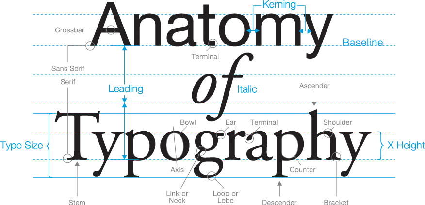
Basic Letterforms
- Baseline : imaginary line at the visual base of the letterforms
- Median : imaginary line defending the x-height of letterforms
- X-height : height in any typeface of the lowercase 'x'
-
Bowl : Rounded form that describes a counter. may be either open or closed
-
Cross-bar : horizontal stroke in a letterform that joins two stems together
-
Ear : The stroke extending out from the main stem or body of the letterform
- Apex/Vertex : The point created by joining two diagonal stems
- Arm : short strokes off the stem of the letterform
-
Ascender : the portion of the stem of a lowercase letterform that projects
the above median
- Barb : the half-serif finish on some curved stroke
- Bracket : the transition between the serif and the stem
-
Cross stroke : the horizontal stroke in a letter form that joins two stems
together
- Crotch : the interior space where two strokes meet
-
Descender : the portion of the stem of a lowercase letterform that projects
below the baseline
-
Em/en : referring to the uppercase M, and em is now the distance equal to
the size of the typeface. An en is half the size of an em.
- Finial : the rounded non-serif terminal to a stroke
-
Ligature : the character formed by the combination of two or more
letterforms
- Spine : the curved stem of the S
-
Stress : orientation of the letterform, indicated by the thin stroke in
round letterforms
- Swash : flourish that extends the stroke of the letterform
-
Link : the stroke that connects the bowl and the loop of the lowercase g
Fig 1.7 Anatomy of Letterform https://osmanassem.com/typography-the-anatomy-of-a-letter/
The Font
Fig 1.8 uppercase and lowercase
-
Small capitals : uppercase letterforms are drawn to the x-height of the
typeface.
-
Uppercase numerals : they are the same height with the uppercase letters
and all set to the same kerning width
-
Lowercase numerals : they are set to x-height with the ascenders and the
descenders
-
Miscellaneous characters : they can change from typeface to
typeface
-
Ornaments : they are used as flourishes in invitations or certificates.
often provided as a font in a larger typeface family
Describing typefaces
-
Roman : uppercase forms are derived from inscriptions on Roman
monuments
- Italic : based on 15th century Italian handwriting
- Oblique : based on Roman form of typeface
- Boldface : characterized by thicker stroke than Roman form
- Light : characterized by lighter stroke than Roman form
- Condense : condensed version of Roman form
- Extended : extended version of Roman form.
Week 3 — Animating our Type Expressions
After receiving feedback
on our 4 digitized type expressions, we were required to make an animated
version of one of the type expressions using Adobe Illustrator and Photoshop.
We learnt how to make the animation through watching a pre-recorded video on
how to animate our digitized type expression. Then we started to experiment
with those two applications and make a short gif animation.
Text/Tracking
1. Kerning, Letterspacing, and Tracking
Kerning: refers to the
automatic adjustment of space between letters
Tracking: addition and
removal of space in a word or sentence
Letterspacing: refers to adding
spaces between letters
Fig 1.9 Example of Kerning https://en.wikipedia.org/wiki/Kerning
Fig 1.10 Normal Tracking, loose tracking, and tight tracking
Uppercase letterforms are drawn to be able to stand on their own; lowercase
letterforms require the counterform created between letters to maintain the line
of reading.
2. Formatting Text
Flush Left
-
Format that closely mirrors the asymmetrical experience of handwriting where
each line starts at the same point but ends whenever the last word on the
line ends.
-
Spaces between words are consistent throughout the text, allowing the type
to create an even gray value
Fig 1.11 Flush left, ragged right
Centered
-
Format imposes symmetry upon the text, assigning equal value and weight to
both ends of any line.
-
Transforms fields of texts into shapes, thereby adding pictorial to
material that is non-pictorial by nature.
Fig 1.12 Centered, ragged right and left
Flush Right
- Places emphasis on the end of a line as opposed to its start.
-
Can be useful where the relationship between text and image might be
ambiguous without strong orientation to the right.
Fig 1.13 Flush right, ragged left
Justified
- Format imposes symmetrical shape on the text.
-
achieved by expanding or reducing spaces between words, and sometimes,
between letters.
-
Resulting openness of lines can occasionally produce 'rivers' of white
spacing running vertically through the text.
Fig 1.14 Justified
3. Texture
Fig 1.15 Anatomy of Typeface
Fig 1.16 Different typefaces and different gray values
Shows how different typefaces have different gray values varying from light to
dark values. Best choice would be the middle gray value.
4. Leading and Line Length
Fig 1.17 Example of Leading and Line length
https://www.fonts.com/content/learning/fontology/level-2/text-typography/length-column-width
-
Type size : Text type should be large enough to be read easily at arms
length
-
Leading : Text set too tightly encourages vertical eye movement where a
reader can easily loose his or her place; Type set too loosely creates
striped patterns that distract reader from material at hand.
-
Line length : Appropriate leading for text is as much a function of line
length as its a question of type size of leading.
- Shorter lines : less leading
- Longer lines : more leading
- Rule of thumb : keep line length between 55-65 characters.
5. Type Specimen Book
A type specimen book shows samples of typefaces varying in sizes to
provide an accurate reference for type, type size, type leading, type line
length, etc. It is often applied to headlines and text in a variety of sizes.
Fig 1.18 Example of Type Specimen Sheet
Compositional requirement : Text should create a field that can occupy a page
or a screen. Ideal text having middle gray value.
Week 4 — Text Formatting
The class starts with each of the students receiving feedback for their
animations of the type expression. Then we were required to watch 4 recorded
videos elaborating on text formatting on Indesign which will guide us to start
our next task exercise on type formatting.
1. Indicating Paragraphs
-
¶ Pilcrow - holdover for medieval manuscripts seldom use today.
-
'line space' (leading*) - it ensures cross-alignment across columns of
text.
Fig 1.19 Line Spacing Vs leading
Fig 1.20 Example of Standard Indentation
Standard Indentation : Indent is the same size of the line spacing or
the same as the point size of the text.
Fig 1.21 Example of Widow and Orphan
These are not advised to have in your type format;
-
Widow : short line of type left alone at the end of a column of
text. (Possible Solution : rebreak line endings throughout your
paragraph so that the last line of any paragraph is not noticeable
short.)
-
Orphan : short line of type left alone at the start of a new column
(Possible Solution : make sure no column text starts with the last
line of the preceding paragraph.)
2. Highlighting Text
Fig 1.22 Example of Highlighting Text with Sans Serif Font
Univers Sans Serif font has been reduced by 5 to match the x-height of
the serif typeface. 8 does not = 7.5.
Fig 1.23 Quotation Marks
Quotation marks can create a clear indent, breaking left reading axis.
Fig 1.24 Example of the usage of A head
A Head : indicates clear break between topics within a section.
Heads are often a set larger than the text, in small caps and bold.
Fig 1.25 Example of the usage of B head
B Head : to subordinate to A heads. indicates new supporting argument
or example for topic at hand. Here they are shown in small caps, italic,
bold serif, and bold san serif.
Fig 1.26 Example of the usage of C head
C Head : highlights specific facets of material within B head text.
Does not interrupt the flow of reading. Shown in small caps, italics,
serif bold, and san serif bold. Followed by an em space for visual
separation.
3. Headline within Text
Fig 1.27 Example of Headlines within Text
Putting together a sequence of subheads = hierarchy. No single way to
express hierarchy within text
4. Cross Alignment
Fig 1.28 & Fig 1.29 Cross aligning headlines
Cross aligning headlines and captions with text type reinforces the
architectural sense of page while articulating the complimentary vertical
rhythms. In this example, four lines of caption type cross align with three
lines of text type.
Week 5 — Understanding Letterforms
Fig 1.30 Uppercase Letterform Example in Baskerville
Uppercase letterforms suggest symmetry, but it is not symmetrical. Each
bracket connecting the serif to the stem has a unique arc.
Fig 1.31 Uppercase Letterform Example in Univers
Width of the left slope is thinner than the right stroke. Both Baskerville and
Univers demonstrate meticulous care a type designer takes to create
letterforms that are internally harmonious and individually expressive.
Fig 1.32 Lowercase Letterform Example of Helvetica (left) & Univers
(right)
Similar sans-serif typefaces are shown above which are Helvetica and Univers.
A comparison of how the stems of the letterforms finish and how the bowls meet
the stems quickly reveals the palpable difference in character between the
both of them.
Maintaining X-height
Fig 1.33 Lowercase letterforms maintaining the x-height
X-height generally describe the size of the lowercase letterforms. Curved
strokes such as 'S' must rise above the median (or sink below the baseline) in
order to appear to be the same size as the vertical and horizontal strokes they
adjoin.
Counterform / Counter : space describes, and often contained, by the
strokes of the form. When letters are joined together to form words, counterform
includes the space between them. How well the counters are handled determines
how well the words hang together.
Fig 1.34 Example of Counterform
Contrast
Fig 1.35 Examples of Contrast Letterforms
Simple contrasts produces numerous variations : small+organic/
large+machined; small+dark/ large light, etc.
❥INSTRUCTIONS
<iframe
src="https://drive.google.com/file/d/1L9JIAjXI7R8k7l8e4PzF8YidT-R80IPC/preview"
width="640" height="480" allow="autoplay"></iframe>
❥EXERCISES
Task 1 : Exercises — Type Expression
1. Idea Sketches
For Exercise 1, we are given a set of words to choose from and to create a
type expression of, The chosen words are distort, cozy, fragile,
accelerate. We are limited to only the following 10 typefaces which are
Adobe Caslon Pro, Bembo, Bodoni, Futura, Gill Sans, Garamond, New
Baskerville, Janson, Serifa, and Univers.
Fig 1.1 Type expression sketches, Week 1 (5/9/2022)
The words I chose are distort, cozy, bite and accelerate. I sketched
my ideas digitally on iPad in the app called Ibis x paint. On the
bottom of the page I wrote some of my ideas, concept and kinds of
typefaces that I'm planning to use for each of the 4 words.
After the feedback, I decided to go with the first design for
"Distort" (1.1) combined with the design in 1.3 to further emphasize
the distortion. For "Cozy" I decided to go for the second design
(2.1) and for "Bite" I decided to go with the 5th design (3.5) as it
is the one that stands out to me. For "Accelerate" I decided to go
with 4.3 combined with 4.2 to convey more movement and speed to
emphasize the word.
2. Digitalization
Fig 1.2 Half way of first attempt of digitalizing "Distort" Week 2
(6/9/2022)
Fig 1.2 shows my first attempt of digitalizing the word "Distort".
I tried going for my first sketch idea of "Distort" since the idea
of utilizing the box to distort the words emphasized the context
of "Distort" well but it didn't really work out since stretching
the letters weren't allowed. I tried to use the Futura Std Medium
font to try make it look less stretched but it still look
stretched so I had to redo it and come up with another idea and
tried to maintain that concept of utilizing the box to visualize
"Distort".
Fig 1.3 Attempt 2 of "Distort" Week 2 (6/9/2022)
I tried to utilize the size of the box to distort the words without
stretching the letters, so instead of stretching the letters one by
one I decided to change their perspectives into opposite directions to
still have that distorted look. Three words of Distort were used
instead of one because one word of distort wouldn't emphasize the word
enough. A combination of three of them stacking each other would give
it that distorted look in a box. To emphasize the words further I
decided to reflect those 3 words and gave it a lighter shade of gray,
then place them behind the 3 distorted words.
Fig 1.4 Attempt of digitalizing "Cozy" Week 2 (6/9/2022)
For "Cozy" I was trying to go for a relaxed look by using a round font
but there wasn't any so I decided to use Futura Std Light for the "C"
and Futura Std Medium for the words o-z-y. The letters o-z-y were
placed in a way that it looks like a person relaxing inside the "C"
like a round swinging hanging chair. the "z" and the "y" are placed to
look like the body and the legs, where the bottom tip of the letter
"z" and the top tip of the letter "y" is the knee of the figure. Small
z's were added with each of them in smaller sizes and lighter colours
as it goes further from the "z" to emphasize the word "cozy" of
someone sleeping. I wanted to give a sense of a rocking motion to the
letter "C" so I added curved lines on the top and bottom of the "C".
To emphasize the word cozy further, I decided to switch the colours
between the type expression and the background to visualize someone
sleeping in a dark room.
Fig 1.5 Attempt of digitalizing "Bite" Week 2 (6/9/2022)
I went for the last sketch since it seemed more appealing to me but I
decided to turn the whole typeface 90 degrees so the letter "E" would
look more like teeth biting onto the B-I-T. I tried to go for a
cartoony look for the font so I chose a thick font which is Futura Std
Bold. White circles were added on top of the "I" and the "T" to make
it look like a bite and for the last step I added a bunch of low
capital letters of b-i-t-e in lower case to convey crumbs from the
bite and as it got further from the "I" and "T" the crumbs are smaller
in size and has a lighter shade.
Fig 1.6 Attempt of digitalizing "Accelerate" Week 2 (6/9/2022)
I wanted to experiment with the distort tool in adobe illustrator
to alter the perspective of the word "Accelerate" to further
visualize the context of the word and give it a sense of movement
and speed, like how the MRT speeds up. The dashes duplicating the
letter A emphasizes the movement and speed of the word
"Accelerate".
Final Outcome for Task 1 Exercise 1 : Type Expressions
Fig 1.7 Final Design of Digitalized Type Expressions (6/9/2022)
Fig 1.8 Final Design of Type Expressions Week 3 (13/9/2022)
3.Type Expression Animation
We were told to watch a recorded video on the demonstration of
making an animated type expression using Illustrator and Photoshop.
Fig 1.9 Process of Animation of "Cozy" on Illustrator Week 3
(13/9/2022)
Fig 1.9 Process of Animation of "Cozy" on Photoshop Week 3
(13/9/2022)
I decided to go with a rocking animation for Cozy, but it
was a bit of a challenge trying to animate the z's forming
and floating away at the same time as the rocking animation
plays.
Fig 2.1 First Attempt of animating "Cozy" Week 4
(20/09/2022)
The C is rocking too fast and its lacking a slow rocking/swinging
smooth animation that conveys the message of cozy. More frames are
needed to make the animation less stiff
Fig 2.2 Final Animation of "Cozy" Week 4 (20/09/2022)
Task 2 : Exercises — Type Formatting
In the second exercise, we are instructed to create two type formats
that covers all the aspects of text formatting in Adobe Indesign which
includes kerning, tracking, leading, paragraph spacing, and alignment.
Type Formatting 1
Fig 3.1 Text Formatting With and Without Kerning Week 4 (20/09/2022)
Fig 3.2 Comparison of Texts Before and After Kerning, Week 4
(20/09/2022)
Type Formatting 2-4
Fig 4.1 Process of Text Formatting on Indesign, Week 4 (20/09/2022)
Fig 4.2 Mistake in Widow, Week 5 (26/09/2022)
After the first attempt of organizing the format, I realized one
of the paragraphs consisted of a widow, which isn't allowed as
it leaves too much white space between paragraphs or at the
bottom of a page which interrupts the reading for the viewer. So
I adjusted the tracking of the sentences to avoid that
mistake.
Fig 4.3 First attempt of Type Formatting, Week 5 (26/09/2022)
Although good ragging, cross alignment, leading and other type
settings are achieved in the first attempt, the layout of the text
is too cramped and requires further exploration of repositioning of
the text and images so I decided to experiment on positioning the
text and the images to create more layouts.
Fig 4.4 Process of Experimenting with Different Text Format Layouts,
Week 5 (26/09/2022)
Fonts : Adobe Caslon Pro (Roman, Italic, and Bold)
Point size : 10 pt (body text), 14 pt (image captions), 40 pt
(heading)
Leading : 12 pt (body text), 34 pt (heading)
Paragraph spacing : 11.99 pt
Line length : 47 pt
Alignment : Left aligned
The first layout still needed more exploring on the positioning of
the images and the text, therefore the final layout chosen will be
the second as it is the most preferred.
Final Outcome for Task 1 Exercise 2 : Text Formatting
Fig 4.5 Final Design of Text Formatting, Week 5 (26/09/2022)
Fig 4.6 Final Design of Text Formatting with guides and grids
Fig 4.5 Final Design of Text Formatting with and without visible
grids and guides, Week 5 (26/09/2022)
❥FEEDBACK
Questions:
1. Are the explorations sufficient?
2. Does the expression match the meaning of the
word?
3. On a scale of 1–5, how strong is the idea?
4. How can the work be improved?
Week 2 — Task Exercise 1
General Feedback — Good sketches, great way of presenting the
sketches and the ideas, excellent presentation overall.
Specific Feedback — I came out with 4-5 designs for each of the 4 words. First
design of "Distort" is good as it consists of 3 words without a
definite shape composed in a box. "Cozy" with the z's fading
upwards visualizes a sleepy expression which conveys the meaning
of cozy. "Bite" did not receive any remarks "Accelerate" has
lines fading into a lighter shade of gray duplicating the line
of the letter A to emphasize movement and speed.
Week 3 — Task Exercise 1
General Feedback — I digitized four of the type expressions.
Good work overall and fulfilled the requirements, no specific remarks
were given for any of the designs.
Week 4 — Task Exercise 1
General Feedback — Animation of "Cozy" is good enough and no
specific remarks were given.
Week 5 — Task Exercise 2
General Feedback — Type settings such as cross alignment, type point
size, ragging, leading, paragraph spacing is good but overall layout
is all over the place.
Specific Feedback — The layout of the type format is too crammed due
to the positioning of the images and the headings and captions
therefore lacks balance between the left and ride side of the page.
❥REFLECTION
Explorations
These 2 exercises taught me the basics of typography. We also created
our blog posts on blogger website for the e-portfolio and sketched out
our ideas for the type expression exercise. Digitization of the
sketches began once we revised our ideas and sketches according to the
feedback given individually.
Observations
Throughout these exercises, various typefaces can be used to express
and visualize type expressions in accordance to the context of the
words. These type expressions also go hand in hand with basic design
elements and principles such as movement, value, and repetition. My
sketches were alright but few of them were challenging to digitize due
to the lack of typefaces that go hand in hand with the context of the
word trying to be conveyed.
Findings
I have found that most typefaces, even the common ones we see in
our day to day life are consisted of complicated and intricate design
processes.
Week 1 — A Type Primer Second Edition (Kane, John, 2011)
Figure 1.1 A Type Primer by John Kane
The book above is written by John Kane on typography and in the
chapter of timeline and classification of typefaces in page 36 of
the book above, Kane discusses the Nineteenth-century types of
typefaces, specifically 'Display Faces'.
Fig 1.2 Display Faces in the 19th Century
In the 19th century, typographers often produced oversized detailed
letterforms to provide colour and contrast on the text page. This
occured around the same time as the development of boldface and for
the same reason, typefounders began casting entire typefaces; upper
ad lowercase decorated. These typefaces are often intended to use
for headlines or display material; hence the term 'Display Face'
The evolution of type technology starting from phototypesetting then
digital rendering, combined with the desire of designers during that
era to introduce novelty has given a rise to the use of those
display faces in settings such as business cards or news
headlines.
Week 2 — Typography Design Process : Form and Communication
(Carter, Rob, 2015)
Fig 1.3 Typographic Design : Form and Communication
The book above is written by Rob Carter on typography design form
communication and in the chapter of typographic design process in
the page 236 of the book above, Carter discusses the transformation
of typography through out the centuries.
Fig 1.4 Bernhardi's experiments on forming new typefaces.
A project done by Ernest Bernhardi engaged in a series of free
typographic experiments with intentions of broadening his
understanding of typographic syntax and exploring new forms of
typographic expression. He has the conception of typography as a
continuous, transformative process which is shared by other forms of
expression which are automatic writing/drawing, collage, and
photography.
The process of experimentations of forming typefaces were executed
by cutting, slicing, tearing, crumpling, scratching, scribbling, and
taping as seen in figure 1.3 above. He repeated those actions until
evocative and enigmatic forms emerged, and he remained open to
abruptly breaking away in search of new typographic effects.
Later on, compositions developed by adding and subtracting elements.
Tearing and trimming were also used which suggests the adding of new
layers, until eventually, an abstract, formal language emerged.
Previous experiments were combined and manipulated into new forms
using a combination of tools and techniques.
Week 3 — Typography Referenced (Haley, A & Al. E, 2012)
Fig 1.5 Typography Referenced
In chapter Typographic Principles in the book called Typography
Referenced by Jason Tselentis, he discusses the general principles
of design when it comes to typography. Designing. type requires a
delicate balance between all the items in the format to deliver
appropriate functional solutions.
Several of the factors that play a crucial role in design are
contrast in size, shape, tone, placement, and colour. Being visually
literate allows the designer to create good composition by giving
words and images a shape, combining them in a composition.
Designing with type requires a working knowledge of the use of the
typefaces such as sans-serif and serif, and the small detailed
differences between the typefaces as well as how they interact when
placed together. Even though many break the rules to create
stylistic marvels for the client's interest, the audience's and
their own, the most valued typographic principles often deals with
purpose, and more specifically function. Readability and design
principles should be considered when designing a book.
Theres a saying that goes, "If all you have is a hammer, everything
looks like a nail." This goes hand in hand with if all a designer
knows is a handful of principles, then all a dseigner can create is
a handful of solutions. Knowing as many rules and principles as
possible helps designers expand their toolbox and decide on when to
use, what to use, etc.
Week 4 — Typography Referenced (Haley, A & Al. E, 2012)
Fig 1.6 Typography Referenced
The book above consists of a theme called Typography Selection which
consists of another topic which is Display Type. The Display Type
needs to catch the viewer's attention. Using typographic size to
gain attention continues to this day.
Slab serifs such as 'Rockwell', 'Memphis', 'Clarendon' all have the
required weight and character for use as display type in headlines
and subheads. Many of the raw visual forms become present for Old
Style and Garalde serif faces when they are enlarged. A variety of
sans serifs and scripts can also be used for headlines and subheads.
Week 5 — A Type Primer Second Edition (Kane, John, 2011)
In the chapter of "English is not Chinese" in page 88 of the book
titled A Type Primer Second Edition, John Kane covers on the flow of
Chinese letterforms being from top to bottom. Even though the
general letterforms are consisted of a left to right flow of
reading, not all letterforms based on languages are written from a
left to right flow. Languages such as Hebrew and Arabic for
instance, read from right to left, and books consisted of those
languages are read from the back to the front. Letterforms in
typefaces consist of a number of attributes intended to reinforce
the left to right flow of written language such as ascenders,
descenders, consistent x-height, counters in lowercase forms
typically appearing to the right. When we read, our brain
assimilates these characteristics thus making it essential for a
readable typeface.
Written Chinese is not based on alphabet, it is rather written in a
series of characteristics called pictographs which are forms that
express an entire word or idea without necessarily indicating how to
pronounce it.
Up until this day, Chinese characters are typically written like
this, read from top to bottom; left to right.
Fig 1.7 Written Chinese Characters
All Chinese characters are drawn to the same width which makes
reading them easy. The characters above are seen to be descending
the page which makes it look natural and have obvious columns.


Comments
Post a Comment