Typographic systems provide sense of purpose and directs decision
making with additional criteria such as hierarchy, order of healing,
legibility, and contrast.
8 Major Variations
1. Axial
All elements are organized to the left or right of a single axis.
Fig 1.1 Example of Axial System
2. Radial
All elements are extended from a point of focus and it is spread out
according to that particular point of focus.
Fig 1.2 Example of Radial System
3. Dilatational
All elements expand from a central point in a circular fashion.
Fig 1.3 Example of Dilatational System
4. Random
Elements appear to have no specific pattern or relationship.
Fig 1.4 Example of Random System
5. Grid
System of vertical and horizontal divisions.
Fig 1.5 Example of Grid System
6. Transitional
Informal system of layered banding.
Fig 1.6 Example of Transitional System
7. Modular
Series of non-objective elements that are constructed in as
standardised units.
Fig 1.7 Example of Modular System
8. Bilateral
All text is arranged symmetrically on a single axis.
Fig 1.8 Example of Bilateral System
Week 2 — Typographic Composition
Principles of Design Composition
- Dominant principles underpinning design composition : emphasis,
isolation, repetition, symmetry, and asymmetry, alignment,
perspective, etc.
- more relevant to imagery than complex units of information that
consists different elements.
Rule of Thirds
- frame can be divided by 3 columns and 3 rows.
- intersecting lines are used as a guide to place the points of
interest within a given space.
Fig 2.1 Rule of thirds example
Typographic Systems
- from the 8 systems the most pragmatic and the most used system is
the Grid System, which is deprived from the grided compositional
structure of Letter Press printing
- further enhanced by what is now come to be termed as the Swiss style
of Typography, with its foremost proponents being Josef Muller
Brockman, Jan Tschichold, Max Bill, and such.
Fig 2.2 Example of Grid System
Other models/Systems
Environmental Grid
- based on the exploration of an existing structure or a numerous
structure combined.
- extraction of crucial lines both curved and straight are formed.
- designer then organizes his information around this super structure,
which includes non-objective elements to create a unique and exciting
mixture of texture and visual stimuli.
- provides context to the forms developed in the designs.
- the system/structures were developed around key features of an
environment associated to the communicators of the message.
Fig 2.3 Example from lecturer Brenda McMannus, of Pratt Inst, from the
book Typographic Form and Communication
Form and Movement
- based on the exploration of an existing Grid Systems.
- developed this system to get students to explore; the multitude of
options the grid offer; to dispel the seriousness surrounding the
application of the grid system; to see the turning of pages in a book
as a slowed-down animation in the form that constitutes the placement
of an image, text and colour.
Week 3 — Context and Creativity
Handwriting
- First mechanically produced letterforms were designed to directly
imitate handwriting
- become the basis or standard for form, spacing, and conventions
mechanical type would try and mimic
- Shape and line of hand drawn letterforms are influenced by tools and
materials used to make them
- Sharpened bones, charcoal sticks, plant stems, brushes, feather and
steel pens all contributed to the unique characteristics of the
letterform
- Additional factors included the material upon which the forms were
written: clay, papyrus, palm leaf, animal skins (vellum and parchment)
and paper
Cuneiform
- earliest system of actual writing, was used in a number of languages
between 34C. B. C. E. through the 1st century C. E.
- distinctive wedge form was the result of pressuring the blunt end of
a read stylus into wet clay tablets.
Hieroglyphics
- Egyptian writing system is fused with the art of relief carving.
- system was a mixture of both rebus and phonetic characters-first
link to a future alphabetic system.
- Hieroglyphic images have the potential to be used in 3 different
ways.
- As ideograms to represent the things they actually depict.
-
As determinatives to show that the signs preceding are meant as
phonograms, to indicate the general idea of the word.
-
As phonograms to represent sounds that 'spell out' individual
words.
Early Greek /5th C. B. C. E
- Built on the Egyptian logo-consonantal system, the
Phoenicians developed a phonetic alphabet consisting of 22
letters.
- Greek was often read in a format known as boustrophedon or
as ox plows.
- One would read left to right and then switch from right to
left
- Early Greek letters were drawn freehand, not constructed
with compasses and rule, and they had no serifs-neither
informal entry and exit strikes left by a relaxed fluent
writer, nor symmetrical finish stroke typically added to
letters by formal scribes.
- Strokes of letter grew thicker, the aperture lessened, and
serifs appeared.
- New forms used for inscriptions throughout the Greek
empire, served as models for formal lettering in imperial
Rome.
- Roman inscriptional letters-written with a flat brush held
at an angle with a broad nib pen, then carved into the stone
with mallet and chisel; served in their turn as models for
calligraphers and type designers for the past two thousand
years.
Roman Uncials
- 4th century Roman letters becoming more rounded, curved
form allowed for less strokes, could be written faster
English Half Uncials, 8th C.
- Evolved into a more slanted and condensed form.
- Writing on the European continent devolved considerably
and needed a reformer.
- Came in Carolingian Handwriting Reform.
Carolingian Miniscule
- capitals at start of sentence, spaces between words and
punctuation.
- used for all legal and literary works to unify
communication between various regions of the expanding
European empire.
- important as a development as standard Roman capital.
- style that became the pattern for the Humanistic writing
of the 15th century.
- basis of our lower case roman type.
Fig 2.4 Different types of handwriting throughout the eras
Black letter 12-15 C. CE
- Gothic was the culminating artistic expression of the middle
ages, occurring from 1200—1500.
- Term Gothic originated with the Italians who used it to refer
to rude or barbaric cultures north of the Italian Alps.
- Characterized by tight spacing and condensed lettering.
- Evenly spaced verticals dominated the letterform.
- Condensing line spacing and letter spacing reduced by amount
of costly materials in book production.
Italian Renaissance
- Embrace of ancient Greek and Roman culture spurred a creative
wave through Italian art, architecture, literature and
letterform design.
Movable Type 11 C.—14 C
- Printing (wood block) already had been practiced in China,
Korea, and Japan.
- China attempted to use movable type for print but was
unsuccessful due in part to the number of characters.
- Introduction of moveable type was introduced in the 1000-1100
CE.
- Innovation was pioneered in China but achieved in Korea
(Diamond Sutra).
Fig 2.5 Black letter and Moveable Type
Handwriting
- With digital revolution, west would begin to digitize many of its
historical creations and type foundries would create, market and sell
or license them.
- Recognition of the importance of these historical letterforms is
something to be admired and learned from.
- With colonization of east by west, much of heritage and cultural
practices in literature, arts and crafts, languages and scripts would
be halted or stunted.
Evolution of Middle Eastern Alphabets
- important to note that while the Phoenician letter marks a turning
point in written language
- script itself has been possibly influenced by Egyptian Hieroglyphics
and Hieratic Scripts.
Evolution of the Chinese Script
- from oracle bone to Steal Script to Clerical Script, Traditional and
Simplified scripts.
Fig 2.6 Evolution of Middle Eastern Alphabets and Chinese Script
Brahmi script (450-350 BCE)
- earliest writing system developed in India after the Indus script.
- one of the most influential writing systems; all modern Indian
scripts and several hundred scripts found in Southeast and East Asia
are derived from Brahmi.
- origin of the script derived or influenced by Semitic scripts.
Fig 2.7 Brahmi Script
Southeast Asia Scripts
- Oldest writing systems present in Southeast Asia were Indian
scripts.
- Most important would be Pallava : South Indian script originally
used for writing Sanskrit and Tamil.
- highly influential, becoming the
basis for writing systems across Southeast Asia
- Pra-nagari : early form of the Nagari script, used in India for
writing Sanskrit, can be seen today in the Blanjong inscription of
Bali.
Indonesia Scripts
Kawi Script
- Indonesia's historical script in Nusantara.
- Word Kawi comes from Sanskrit term kavya meaning poet.
- Script is used for contact with other kingdoms.
- became the basis of other scripts in both Indonesia and the
Phillippines.
- Ancient kingdoms in Malay Peninsula would have been using both
Indian scripts and Kawi to write old Malay language.
Fig 2.9 Laguna Copperplate Inscription written in Kawi
Incung Script
- from Kerinci.
- original script.
- comes from South Sumatra.
- grouping of scripts known as "Rencong".
Fig 2.10 Incung Script
Jawi Script
- Arabic-based alphabet, introduced along with Islam.
- Ancient Hindu societies in both South and Southeast Asia were
classist and often caste-based.
- Lower classes were generally illiterate.
- Every hikayat and Malay charm book is written in Jawi.
- Unlike Indonesia, Malaysia doesn't have a huge wealth of pre-Jawi
inscriptions and writings.
Programmers and Type Design
- More vernacular scripts being produced by software
giants(google)
- Muthu Nedumaran : being produced to cater to situations where the
written matter is communicated in the vernacular script or vernacular
and Latin scripts
- Huruf : local group of graphic designers
interested in the localized letting of latin and vernacular letters
painted or inscribed on walls and signages are amongst the more
prominent organizations digitizing and revitalizing typefaces in
Malaysia.
"Looking behind gives you context. Looking forward gives you
opportunities."
Week 4 — Designing Type
Xavier Dupré (2007) suggested 2 reasons for
designing a typeface :
- type design carries a social responsibility so one must continue to
improve its legibility.
- type design is a form of artistic expression.
Adrian Frutiger
- renowned twentieth century Swiss graphic designer.
- responsible for the advancement of typography into digital
typography.
- Frutiger font
-
sans serif typeface designed by the Swiss type designer Adrian
Frutiger in 1968, for newly built Charles de Gaulle International
Airport in France.
-
Purpose : to create clean and distinctive and legible typeface
thats easy to use from close up and far away.
-
Considerations/limitations : Letterforms needed to be recognized
even in poor light conditions or when reader was moving quickly
past the sign.
Fig 4.1 Airport Signage using Frutiger
- Devanagari font
-
modern typesetting and printing processes at request of the Indian
Design Institute.
-
Goal : simplify the sacred characters, without compromising their
ancient calligraphic expression.
Matthew Carter
- contemporary British type designer and ultimate craftsman.
- trained as a punchcutter at Enschedé by Paul Rädisch, responsible
for Crosfield's typographic program in the early 1960s.
- his fonts were created to address specific technical challenges .
- Verdana font
-
Purpose : turned to be extremely legible even at very small sizes
on screen due to popularity of electronic devices.
-
Considerations/limitations : exhibit characters derived from pixel
rather than the pen, brush or the chisel.
- Commonly confused characters such as lowercase i, j, l.
Fig 4.2, 4.3 Verdana font and Close up of Verdana font being
pixelated
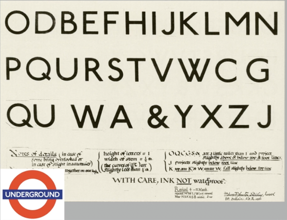
Edward Johnston
- creator of hugely influential London "Underground" typeface.
- later come to be known as Johnston Sans (1916).
- created typeface with "bold simplicity", modern yet rooted in
tradition.
- Underground typeface, Johnston Sans
-
combined classical Roman proportions with humanist warmth
-
Purpose : London's Underground railway ordered a new
typeface for his posters and signage from the calligrapher
Edward Johnston.
-
Consideration/limitation : Johnston's remit was to reunite
the London Underground Group, different companies all using
the same rails as tunnels. Johnston applied the proportions
of Roman capital letters to his typeface so it was rooted in
traditional calligraphy but it has an elegance and a
simplicity that absolutely fitted the modern age.
- Gill Sans font
- created by Eric Gill.
- heavily based on Johnston's font.
Fig 4.4 Underground typeface and logo
General Process of Type Design
1. Research
- when creating type, understand type history, type anatomy and
type conventions
- know terminologies, side-bearing, metrics, hinting.
- important to determine the type's purpose or what it would be
used for, what different applications it will be used in.
- examine existing fonts that are presently being used for
inspiration / ideas / reference / context / usage / pattern / etc.
2. Sketching
- designers sketch their typeface using traditional tool set
(brushes, pens, ink and paper) then scan for the purpose of
digitization.
- some designers sketch their typeface using digital tool sets
such as Wacom directly into a font design software which is much
quicker, persistent and consistent but this can impede natural
movement of handstrokes.
3. Digitization
- software to make fonts are Fontlab and Glyphs App.
- Designers use Adobe Illustrator to design or craft the letterforms
and then introduce it in specialized font apps.
- attention should be given to the counter form, readability of the
typeface is heavily dependent on it.
4. Testing
- important component in design thinking process.
- results of testing is part of the process of refining and
correcting aspects of the typeface.
- prototyping : part of the testing process and leads to important
feedback.
- readability and legibility of the typeface becomes an important
consideration.
5. Deploy
- even after deploying a completed typeface there are teething
problems that did not come to fore during prototyping and testing
phases thus task of revision doesn't end upon deployment.
- Rigour of testing is important so teething issue remain minor.
Typeface Construction
Roman Capital
- grid consists of square, inside it a circle that just touches the
lines of the square in four places.
- within the square, there is also a rectangle.
- rectangle is three quarters the size of the square and is positioned
in the centre of the square.
- using grids (with circular forms) can facilitate the construction of
a letterform.
Construction and considerations
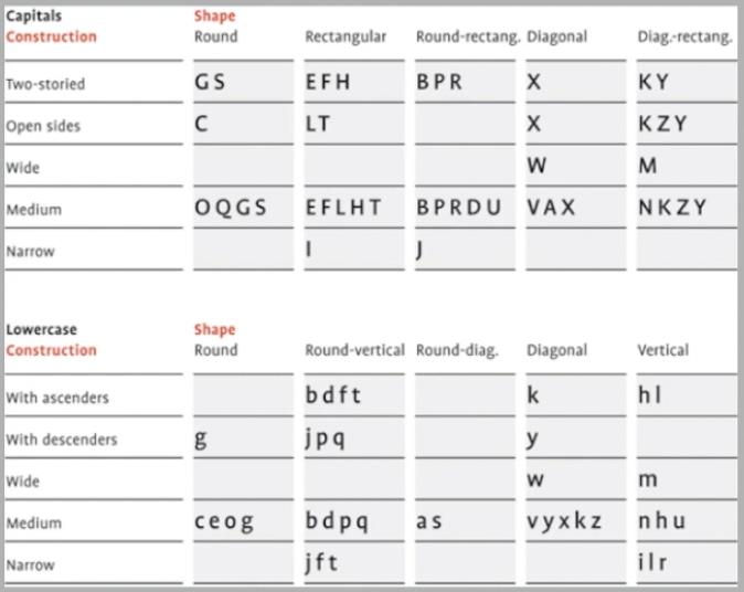
- 26 characters of the alphabet can be arranged into groups, whereby a
distinction is made between a group for the capitals and a group for
lowercase letters
Fig 4.5 Group of capitals and lowercase letters
- different forms of constructions must be taken into account when
designing a new type.
- important visual correction is extrusion of curved forms past the
baseline and cap line.
- applies to vertical alignment between curved and straight forms.
- visual correction also needed for distance between letters.
- letters must be altered to a uniform 'visual' white space.
- white space between letters should appear the same (called fitting
the type).
- Intrinsic can be best summed up this way, designer has inexplicable
need driven by interest to design a typeface, and seeks out a form
that comes close to fulfilling a desire.
- Extrinsic can be summed up in this way the designer has commissioned
or the student-designer has a task to complete that involves designing
a typeface.
"The mindset of a type designer—if clinically studied—might be
construed as sick; plagued by an unusual obsession to detail."
— Vinod J. Nair
Week 5 — Perception & Organization
Perception is basically known as the way that something is
perceived or interpreted. In typography, perception involves how
readers would visually navigate and understand the content, which
is influenced by factors such as contrast, form and organization.
The content can be textual, visual, graphical or in the form of
colour.
Contrast
Important to create contrast for distinction. The
reader would have difficulty trying to distinct different types of
information if a text in a book does not have contrasts.
Fig 1.1 Several methods in typography to create contrast; devised
by Rudi Ruegg
Carl Dair adds 2 more principles into the mix, which are texture
and direction. Dia rposts 7 kinds of contrast which namely are;
- Size
- Weight
- Contrast of form
- Contrast of structure
- Contrast of texture
- Contrast of colour
- Contrast of direction
1. Contrast / Size
Contrast of size provides a point to which the reader's attention is
drawn. So for example if there is a big letter and a small letter,
you would obviously see the bigger letter first instead of the
small. Often the use of size is in making a title or heading bigger
than the body text.

Fig 1.2 Contrast in sizes of texts
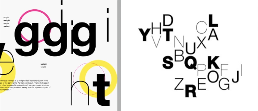
2. Contrast / Weight
It describes how bold type can
stand out in the middle of lighter type of same style. Commonly
used for visual attraction, highlighting a particular point within
a body of text. Provides a heavy area for emphasis.
Fig 1.3 Contrast in weight of texts
3. Contrast in FormIt is the distinction between
a capital letter and lowercase equivalent, or a roman letter and its
italic variant, condensed and expanded versions of typeface which
includes under the contrast of form.
Fig 1.4 Contrast in form of texts
4. Contrast in Structure
Creating contrast using the structure of the letterform so for
example, a monoline sans serif and a traditional serif or an italic
and a blackletter.
Fig 1.5 Contrast in structure of texts
5. Contrast in Texture
Contrast of texture is achieved when putting together the contrasts
of size, weight, form and structure on a block of text on a page.
Texture generally refers to the way the lines of type look as a
whole up close from a distance which depends partly on the
letterforms themselves and partly on how they're arranged. By
creating layers of texture within a layout would create contrast and
also visual impact that draws the eye.
Fig 1.6 Contrasts in Texture in bodies of text
6. Contrast in Direction
Opposition between vertical, and horizontal, and angles in between.
Turning one word on its side can have a dramatic effect on a layout
and mixing wide blocks of long lines with tall columns of short
lines can create contrast.
Fig 1.7 Contrast in Direction in text
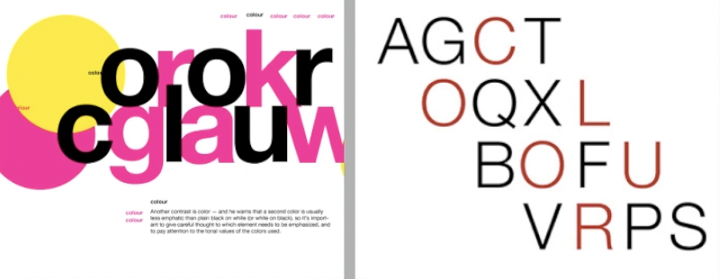
7. Contrast in Colour
Use of colour is suggested that a second colour is often less
empathic in values than plain black on white. Therefore it is
important to give thought to which element needs to be emphasized
and to pay attention to tonal values of colours that are used.
Fig 1.8 Contrast in Colour in text
When making contrast within texts make sure they are
harmonious.
Form
Refers to overall look and feel of the elements that makes up a
typographic composition. Form is crucial as it creates the most
visual impact and first impressions. Generally a good form in
typography would tend to be visually intriguing to the eye as it
leads the eye from point to point and entertains the mind and is
most often memorable. There is always duality between form and
functionality and having a balance between both is preferable.
Fig 1.9 Examples of form
Interplay of meaning and form brings a balanced harmony both in
terms of function and expression. When a typeface is perceived as
a form, it no longer reads as a letter because it has been
manipulated by distortion, texture, enlargement and has been
excluded into a space. This depends on the level if decoration and
expression of it
❥INSTRUCTIONS
<iframe
src="https://drive.google.com/file/d/1-dStVPlrt_RjfD-hDfrDRKqbk364v1Xg/preview"
width="640" height="480"
allow="autoplay"></iframe>
❥TASK
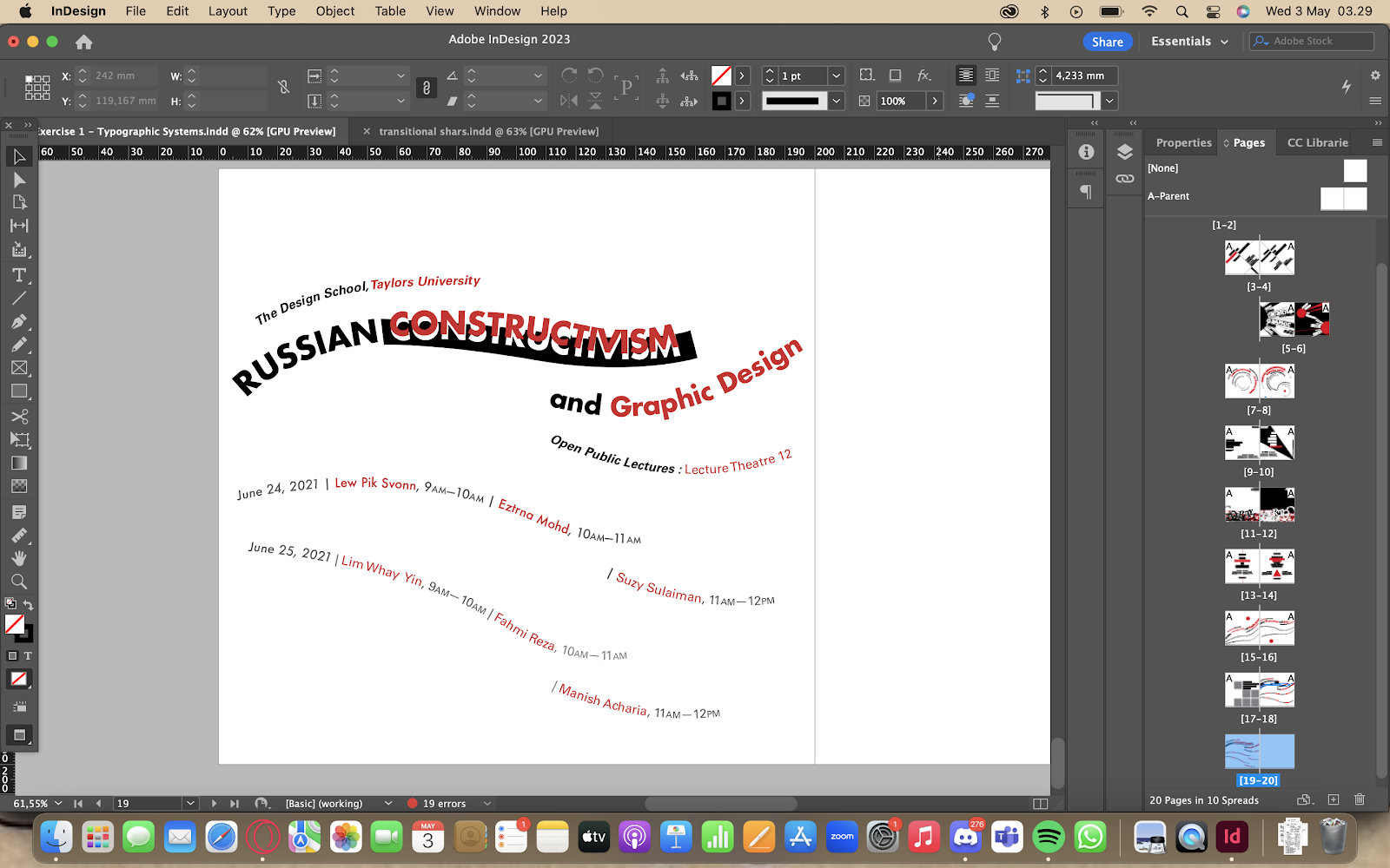
Task 1 — Exercise 1 : Typographic Systems
This exercises requires us to explore 8 typographic systems which
are Axial, Radial, Dilatational, Random, Grid, Modular,
Transitional, Bilateral in Indesign with the content provided in
the MIB. Make sure to keep the graphical elements minimal and use
a maximum of 3 colours (black + white + additional colour)
Week 1 First Attempts on Axial System
For our first
attempts we were told to follow a tutorial video on the Axial
System.
Fig 1.1 First and Second attempts on Axial System, Week 1
(5/04/2023)
Brief Research on Constructivism
-
Constructivism is an early twentieth-century art movement
that was found in 1915 by Vladimir Tatlin and Alexander
Rodchenko.
-
It was an artistic and architectural theory that originated
in Russia. It aims to reflect modern industrial society and
urban space. This was a rejection of the idea of autonomous
art by constructing it.
-
Russian Constructivism characteristically used minimal color
palettes, often just red, black and sometimes yellow.
-
The Constructivists sought to influence architecture,
design, fashion and all mass-produced objects.
-
There are some basic characteristics of Constructivist art
which includes the use of geometric or technoid primary
forms, arranged in a space or surface in harmonious
order.
-
Constructivist painters rejected bright, colourful palates
and experimented with the effects of light and
movement.
Progression Digitisations
After doing a brief research on Russian Constructivism, I
attempted to keep the colour palette (mainly red and black) as
well as the visual elements relevant to the context of Russian
Constructivism.
Axial System
Fig 1.2 Progression for Axial, Week 2 (12/04/2023)
My first and second attempt was following the tutorial video
that Mr Vinod provided, I wasn't really familiar with the Axial
system yet thus my exploration was limited, thus I decided to
redo my Axial systems since I wasn't too satisfied with it.
Fig 1.3 Progression for Axial, Week 2 (12/04/2023)
My third and fourth attempts were me exploring with including
more elements that go hand in hand with the Axial System thus
making it more visually appealing and adds dynamism and
maintaining visual hierarchy, though I am more fond with how the
one on the left turned out.
Radial System
Fig 1.4 Progression for Radial, Week 2 (12/04/2023)
Doing the Radial system I became more confident with exploring
more visual elements to implement in my design but also keeping
the Radial system in mind, thus I am proud of the outcome for both
the first and second attempts. The red beam emphasizing
constructivism is kept to balance and convey the concept of
Russian Constructivism in a sense that is geometric.
Dilatational System
Fig 1.5 Progression for Dilatational, Week 2 (12/04/2023)
My first and second attempts on Dilatational system were decent,
but its still lacking in terms of visuals and dynamism and looks
empty due to the amount of space left untouched, so I decided to
do further refinement.
Fig 1.6 Progress for Dilatational, Week 2 (12/04/2023)
I focused more on refining the one on the right since I was more
fond of that because it looked more unique and had more potential
for dynamism. To improve its visuals and fill its empty space, I
decided to add more visual elements to add a touch of aesthetics.
Random System
Fig 1.7 Progression for Random, Week 2 (12/04/2023)
The Random system took quite awhile to construct since I
repeatedly unintentionally arranged it to be organized, but the
desired look was achieved after quite some time of refinement. In
a sense I wanted it to look like the letters and words were
overlapping each other but also support each other, giving a sense
of 'Construction'.
Grid System
Fig 1.8 Progression for Grid, Week 2 (12/04/2023)
I was perplexed with the Grid system since I did not really
have a grasp on the concept of it thus my first attempt wasn't
the best and leaned more towards experimenting on how the Grid
system works. On my second attempt I became more confident and
tried to incorporate some geometric elements as well as split
the words Russian Constructivism as if it was built on top of
each other part by part to add a sense of
'Construction'.
Bilateral System
Fig 1.9 Progression for Bilateral, Week 2 (12/04/2023)
These two attempts are the ones that took me the least time to
complete since I started to get a better hang of how the systems
work and incorporated geometrical shapes into the design whilst
maintaining the original colour palette.
Transitional System
Fig 1.10 Progression for Transitional, Week 2 (12/04/2023)
I wasn't really satisfied with 2 of my first attempts since it
still looked stiff and had less sense of movement, thus I
decided to try a different approach for my third attempt.
Fig 1.11 Progression for Transitional, Week 2 (12/04/2023)
Modular System
Fig 1.12 Progression for Modular, Week 2 (12/04/2023)
Final Designs in JPEG Format for Exercise 1 : Typographic
Systems
Fig 1.13 Final Axial System Design in JPEG Format (19/04/2023)
Fig 1.14 Final Radial System Design in JPEG Format
(19/04/2023)
Fig 1.15 Final Dilatational System Design in JPEG Format
(19/04/2023)
Fig 1.16 Final Grid System Design in JPEG Format (19/04/2023)
Fig 1.17 Final Random System Design in JPEG Format
(19/04/2023)
Fig 1.18 Final Transitional System Design in JPEG Format
(19/04/2023)
Fig 1.19 Final Modular System Design in JPEG Format
(19/04/2023)
Fig 1.20 Final Bilateral System design in JPEG Format
(19/04/2023)
Fig 1.21 Final PDF of Typographic systems, (19/04/2023)
Fig 1.22 Final PDF of Typographic systems with grid, (19/04/2023)
Task 2 — Exercise 2 : Type & Play
Part 1 : Finding Type
We are instructed to dissect and identify potential
letterforms(4-5 letterforms) in a chosen image of a subject.
Choose a reference typeface from the 10 typefaces.
1. Chosen Subject
The first few subjects are from a sampling of Taylors' lake
observed under a microscope. I decided to go with the third one
since I was leaning towards that more and I could see more
potential to extract shapes of letterforms from the shape of the
microalgae.
Fig 2.1 Samples under Microscope, Week 3 (19/04/2023)
2. Letterform Extraction
Before tracing out the letters I found, I decided to zoom into
the image to observe the characteristics of the micro-algae and
observe how minuscule it is and how it is a single organism with
several segments that branches out thus resembling it as the roots
of a plant.
Fig 2.2 Close up of Freshwater micro-algae
I used procreate to trace out the shapes I found.
Fig 2.2 Traced letters, A, H, Y, E, K; Week 3 (19/04/2023)
3. Digitalisation
I used the pen tool to trace out the shapes on Illustrator.
Fig 2.3 Extracted letters done with pen tool on illustrator, Week 3
(19/04/2023)
I wanted to capture the minuscule branches of the micro-algae but
also refine it in a way that the typeface throughout each of the
letterforms look consistent and looks refined thus I had to minimize
the size, length and the distortion of each of the small branches
and cuts.
Fig 2.4 Reference used, Week 3 (19/04/2023)
Fig 2.5 Second Draft Progress of Refined letterforms, Week 3
(19/04/2023)
Fig 2.6 Third Draft Progress of Refined letterforms, Week 3
(19/04/2023)
By the time I reached the third draft progress, I received a
couple of suggestions and feedback and realized that the
thickness and weight between each of the letterforms are
inconsistent. The 'E' has more weight that it should be so I
reduced the thickness of the 'E' and refined it further whilst
also keeping the characteristics of the micro-algae in mind. I
was kind of doubtful on the 'E' being eligible enough as a
typeface since it is the most deformed and consists of the most
amount of branches so I decided to reduce the amount for that.
The "K" was a bit of a struggle to refine as it is the most
deformed.
Fig 2.7 Fourth Draft Progress of Refined letterforms, Week 3
(19/04/2023)
Looking at the third progress, I noticed that the strokes between
the letterforms were inconsistent, so for the fourth progress, I
decided to work on that to refine it further. I thickened the
stroke for the 'A' and 'H' and reduced the size of the branches to
make the letterforms less deformed. For the 'H' I decided to
refine it and adjusted its form by making it smoother and for 'E'
I reduced the sizes for the branches again and refined the form
and curves of the stroke. For all the letterforms I tried to make
them smoother but purposely didn't make them straight, to keep the
characteristic of the micro-algae of not having a smooth
perimeter.
Fig 2.8 Original extracted letterforms compared to final type
design, Week 4 (25/04/2023)
Final Design in JPEG Format for Exercise 2 : Type and Play
Fig 2.9 Final Design for Type and Play in JPEG format, Week 4
(25/04/2023)
Final Design in PDF Format for Exercise 2 : Type and Play
Fig 2.10 Final Design for Type and Play in PDF format, Week 4
(25/04/2023)
4. Typeface showcase
Fig 2.7 First attempt of integrating Typeface and Image, Week 4
(25/04/2023)
According to feedback, there isn't any integration or
interplay between the image and the typeface, thus I had to change
that.
Fig 2.8 Image Chosen on Photoshop, Week 4 (25/04/2023)
Fig 2.9 Third Attempt of Type & Play, Week 4 (25/04/2023)
Further refinement was required as assigned by Mr. Vinod for the
Type and Play integration of the font and the image.
Fig 2.10 Final JPEG of Type & Play, Week 4 (25/04/2023)
❥FEEDBACK
Week 1 General Feedback Overall looks good and interesting and has an aggressive slant,
has a readable flow of read.
Specific Feedback Looks aggressive due to the slant but the composition of the
text balances it out.
Week 2
General Feedback Most of them look unique and has dynamism, spacing and
leading are good overall.
Specific Feedback
-
For dilatational it is too empty, not centralized and heavy
on the right side of the page thus left side looks
empty.
-
Left bottom corner on radial looks empty since it lacks
graphical elements and text.
-
For grid, the word constructivism isn't really readable
because of how it is broken apart and hyphenated, right area
corner too empty and has too much space meanwhile the left has
most of the text thus the composition not being balanced.
Week 3
General Feedback
Looks unique and refinements manage to capture the
original characteristics of the micro-algae.
Specific Feedback
The thickness of the letters need to be kept more consistent;
Too many cracks and veins shooting various parts of the letters
so minimize that.
Week 4
General Feedback Extraction of letterforms are good and refinements capture
the original characteristics of the micro-algae.
Specific Feedback
There needs to be
some integration and interplay between the letterform and the
object thus putting the letterforms on a background isn't
efficient.
❥REFLECTION
Experience
Exercise 1 was pretty time consuming to do, as I progress
throughout creating compositions according to the various
typographic systems, I found it harder to keep it all consistent.
It was a struggle having to create such visually interesting and
dynamic composition while also having rules and constraints that
contradict creating a visually attractive composition and limiting
our freedom. There were times where I had to abandon and redo some
of the typographic systems to the point they reached my
expectations, and I couldn't say that I am satisfied with each of
the work that I have done, but due to time constraints, I had to
go with what I have made, but overall I think I did well for my
first attempt. The second exercise on the other hand was pretty
fun to do and I got to implement my friend's lab work with my
design, although the type integration between the object and the
image and the extracted letterform was a bit of a struggle.
Observation
Exercise 1
made me realize that having a keen eye to details such as
alignments, leading, spacing between letters, point sizes, etc
aren't the only things to consider within creating a composition
for a typographic system. Paying attention to the bigger picture
instead of always focusing and being drowned in details is
crucial throughout the process of designing a composition.
Consider the layout, the weight distribution, the balance of the
overall composition, and the placement of the text and visual
elements and how that produces negative space and positive space
to balance and create a visually dynamic composition. For the
second exercise, its crucial to pay attention to the
characteristics of the object to further implement on the
letterform while also balancing the thought of making a legible
letterform.
Findings
As I was
attempting to do the first exercise, I lacked confidence and
always viewed typographic systems as something that had too many
strict rules and constraints thus I doubted my skills in being
able to make an uncommon and a visually creative composition but
throughout the process of creating compositions for the
typographic systems, I brought myself to make one composition
look more visually appealing by exploring various visual
elements and different layouts. The second exercise taught me
that it is crucial to maintain the interplay between the object
where the letterforms were initially extracted from as well as
the image being used for the type integration image.
❥FURTHER READING
Fig 1.1 Typographic Systems by Kimberly Elam (2007)
Fig 1.2 Constraints and Options, Typographic Systems Page 10,
Kimberly Elam (2007)
Throughout the process of creating typographic systems, there are
constraints and options that are to be considered and every line
and element must be used in each composition. However such lines
may be broken at will to alter to more than a single line,
creating changes in grouping.
Other than that, leading also alters the position and texture of
the overall composition, as well as spacing in text and word
spacing creates distinct texture.
Fig 1.3 The Circle and Composition, Typographic Systems Page 12,
Kimberly Elam (2007)
I have always thought of the circle as an element that could
further balance the composition of a typographic system, but
reading the page above, it is said to be a wildcard element, which
means they can be used anywhere in the composition. It could act
as a tool to guide the designer's eye, create a pivot point,
tension, and emphasis; or contribute to visual organization or
balance.
Upon reading that page, I have also realized that we cannot just
simply place a circle in the composition since it has the ability
to dramatically change the composition. For instance, placing a
circle between the lines of text can create tension; placing it
close to a set of text can create emphasis, aligning the circle
with lines of text can create a sense of organization.
Fig 1.3 Axial Systems, Thumbnail Variations, Typographic Systems
Page 23, Kimberly Elam (2007)
Designers should both investigate the changes in texture that
occur with positive and negative letter spacing and juxtapose airy
textures with more dense textures. Placement of the axis is
shifted and an appreciation of beauty of asymmetry is developed.
Most unexpected work emerges near the end of the thumbnail process
as self-imposed limitations to what the composition "should" be
are overcome and the designer becomes creative in shaping the
axis, the way the lines break and the organization of the space.
Fig 1.4 Axial Systems, Shaped Background, Typographic Systems,
Page 29, Kimberly Elam (2007)
Creating shapes to be placed in a background of a composition
with text can sometimes be confusing for me, because it could
either be overwhelming over the text or leaving too much of an
empty space within that composition, but what I didn't consider
is that shaped backgrounds actually also serve a purpose of
guiding the viewer's eye, as it follows the text and adds
dynamism and visual interest. These shaped backgrounds can be
altered and implied to use to further emphasize that specific
typographic system, such as that composition above, where the
eye immediately is lead to see the axis of that Axial system.


Comments
Post a Comment