Typography — Task 3 : Type Design & Communication
11.10.2022 — 8.11.2022 (Week 7 — Week 11)
Rachel Madeline Purwanto / 0356994 / Bachelor of Design (Hons) in
Creative Media
Typography
Task 3 : Type Design &
Communication

❥INSTRUCTIONS
❥TASK
Typo Task 3A Typeface Construction
For Task 3A we were instructed to design a set of letters as a font, starting
from idea sketches to digitization. For the sketch, we are allowed to sketch
our designs either in sans serif or serif and uppercase or lowercase. We are
also instructed to use a reference from one of the typefaces from the 10
typefaces given. Deconstruction of typeface is also crucial to study the
anatomical parts of the typeface and to observe the small details in order for
us to be able to pay attention to the intricate details required when
designing a font.
The letters that are to be designed are : a e t k g r l y m p n ! # , .
1. Research - Type Design

Fig 1.1 Anatomy of Typography Week 8 (18/10/2022) https://www.teachmetodesign.com/anatomy-of-typography/
There are some guidelines of typography to consider when designing our font
which is the ascender height, capital height, median line, baseline and
descender line. Other anatomical parts of typography in the above image also
requires equal attention to when designing a typeface. There are also
essential elements that need to be considered which are divided into 4
categories which refer to guidelines, contrast, angle of stress, and
terminals.
A unit used to compare type dimensions within a point size is called an
em square, which will be used as a grid to design each glyph so that
all the glyphs of the typeface will be sized in relation to one another.
The em square is generally divided by the baseline into 2 areas which are the
ascent and the descent.

Fig 1.2 Ascent and Descent of an em square (Exploring Typography by Tova
Rabinowitz Deer) Week 8 (18/10/2022)

Fig 1.3 Overshoot guidelines represented by the dotted lines (Exploring
Typography by Tova Rabinowitz Deer) Week 8 (18/10/2022)
Overshoot guidelines are also crucial to be established to help round
and pointed letters to maintain optical consistency with the other characters.
They include the baseline overshoot, x-height overshoot, the cap height
overshoot, the ascender line overshoot, and the descender line overshoot. The
standard overshoot amounts range between 10 to 20 em units for a 1000 em unit
square which is an extra 1 to 2 percent above or below each guideline.
(Research is referenced from the book Exploring Typography by Tova
Rabinotiwz Deer, Page 254 in chapter 'Designing Type')
2. Sketches

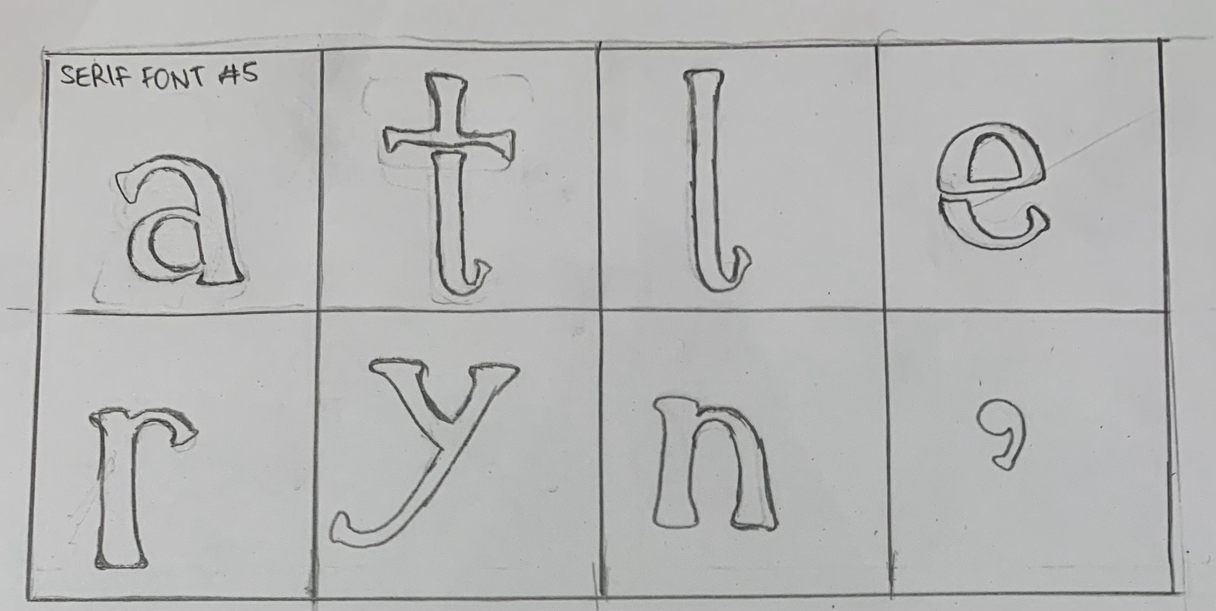
Fig 2.1 Font Design Sketches Week 8 (18/10/2022)
After doing research on Type Design, I decided to proceed with the
sketches and drew them in boxes of 3cm x 3cm to keep the size consistent.
Most of the sketches I drew consisted of Serif fonts rather than Sans
Serif. The sketches that I'm mostly in favor is sketch Serif #1, #2, and
#4 since I'm more fond of Serif fonts rather than Sans serif. Serif fonts
seems more appealing to me as they have more of a dynamic and unique
shape.
3. Identify and Deconstruct


Fig 3.2 Deconstructed 'R' - Bodoni STD Roman Week 9 (25/10/2022)

Fig 3.3 Deconstructed 'T' - Bodoni STD Roman Week 9 (25/10/2022)

Fig 3.4 Deconstructed 'E' - Bodoni STD Roman Week 9 (25/10/2022)
The letters I chose to deconstruct are similar to my font designs of the
letters R, T and E. Similar to my design for the letter R, the letter R
in Bodoni STD font has its tail slightly overshoot the descender. I've
also observed that the E isn't particularly equal as the top part and
the lower part of the E have different lengths in their serifs as well.
4. Digitisation of Font Process

Fig 4.1 Guides Week 10 (1/11/2022)

Fig 4.2 First Attempt Experimentation Week 10 (1/11/2022)
After doing the first attempt on digitizing the type font, I realized I
did a mistake on the height of the letterforms as they are supposed to
stop at the cap height, as well as the bottom of the letterforms which
are supposed to start at the baseline.

Fig 4.1 Attempts on the Y design Week 10 (1/11/2022)
According to the feedback received, the Y looked off as one of the
strokes needed to be thicker and the right side of the Y also needed to
be refined since the flare needed to be thicker near the serif part.

Fig 4.2 Attempts on the N design Week 10 (1/11/2022)
The first attempt looked off since the thick stroke is supposed to be
the one in the middle, so I switched the thickness of the strokes on the
second attempt. Based on the feedback, the N lacked the features and
details that other letters had so I added some details on the third
attempt to make the design consistent with the other letters.

Fig 4.3 Attempt at fixing and designing the punctuation Week 10
(1/11/2022)
According to the feedback, the punctuation design was inaccurate
therefore I had to refine it according to its accurate sizes and
designs. After doing some research I adjusted the punctuation
accordingly. Starting from the comma, which is supposed to be roughly
the height of 2 stacked periods. The size of the comma's head is also
reduced as it is supposed to be slightly smaller than the period. The
exclamation point should be the same height as the capital letters
meaning its length should be from the baseline to the cap height. The
dot of the exclamation is also adjusted to be slightly smaller than the
period. The exclamation mark has a slight overshoot on the top. I also
made sure the stroke of the hashtag is as thick as the width of the
capital letters.

Fig 4.4 First, Second and Third Attempt Week 10 (1/11/2022)

Fig 4.5 Digitized Third attempt of font Week 10 (1/11/2022)

Fig 4.6 Digitized third attempt of font with guides Week 10 (1/11/2022)
Measurements from Baseline
Ascender : 739.77 pt
Cap height : 700.28 pt
Median : 502.12 pt
Descender : 263.16 pt
Serif : 26.881 pt (width), 19.9471 pt (height)
Cross bar 1 (Y, K) : 550 pt
Cross bar 2 (N, M) : 416 pt
Cross bar 3 (A, R, E, P) : 175 pt

Fig 5.1 Process of merging the shapes together for each letter Week 11
(8/11/2022)
Following the demo video, I proceeded to merge the shapes to form the
letters together then copy pasted them onto Fontlab7.

Fig 5.2 Letters on Fontlab7 Before kerning Week 11 (8/11/2022)

Fig 5.3 Letters on Fontlab7 After kerning Week 11 (8/11/2022)
Following the demo video, after I copy pasted each of the individual
letters, I did the kerning for each individual glyph in the metrics
tab.
6. Posters & Final Outcome

Fig 6.1 Clawthorne Demo Typo Poster A4 - JPEG; Week 11 (8/11/2022)

Fig 6.2 Final Task 3A: Type Design and Communication - JPEG; Week 11
(8/11/2022)
Fig 6.3 Final Task 3A: Type Design and Communication - PDF; Week 11
(8/11/2022)
Fig 6.4 Clawthorne Demo Typo Poster A4 - PDF; Week 11 (8/11/2022)
❥FEEDBACK
Week 9
General Feedback — For the sketches, the 1st and the 4th ones are the
preferred sketches to digitize
Specific Feedback — The apex of the 'A' should surpass the cap height
to give it an illusion that it has the same height as the 'R' so the
height of the R has to end at the cap height.
Week 10
General Feedback — The letters A, R, E, L, T, K, P, M, G is fine.
Punctuation needs some work. Make sure the gaps are consistent.
Specific Feedback — The Y looks off as one of the strokes needs to be
thicker. Right stroke of the Y needs to be thicker at the end of it
since its supposed to be flared near the serif. Punctuation not
following the cap height. The N is a little less consistent than the
other letters as it has less curved features and more sharp
features.
Week 11
General Feedback — The typeface for all letters are fine, just needs
minor tweaking and adjustments for few of them.
Specific Feedback — Comma can be thicker. Hashtag could still be worked
on and tweaked. The leg of the 'R' can still be can still be
fixed.
❥REFLECTION
Experience
This project gave us the opportunity for us to develop my first ever
font which was pretty fun to do. It was cool to see how our designed
font came from sketches made on pen and paper then proceeded to be
digitized onto Fontlab7 to be able to used as a real font. This project
made me practice my observational skills as it required me to observe
and analyze fonts that already existed.
Observations
I've observed that if you look closely, there are actually noticeable
details that differ even though the some designs look equal. These
details are important to pay attention to when designing a typeface. One
of them was the punctuation which I had trouble spotting what was wrong
with it after feedback until I did research and realized some of the
sizes of the design are inaccurate. For instance, the dot of the comma
had to be slightly smaller than the period but the whole comma had to be
approximately the height of 2 periods. Small details like those make a
difference in the overall design.
Findings
I found that when designing a font there are a lot of details on the
shapes and sizes and how important it is to make all the letters
consistent on their strokes as well as the contrast of the strokes and
their sizes. It is also time consuming and requires a very detailed
observational study on fonts to be able to design a font.
❥FURTHER READING

Fig1.1 Exploring Typography Second Edition by Towa Rabinowitz
Deer
In the book Exploring Typography Second Edition in the topic of
drawing outline glyphs covered on page 257 features how to draw the
outline of glyphs to designing a letterform. Most designers start by
sketching out their ideas then redrawing them out as line glyphs on
the computer. Its possible to draw glyphs directly onto most
font-editing programs but most designers find it easier to draw their
designs in a drawing program like Adobe Illustrator and then import
their glyphs into a font-editor for fine-tuning. This is due to
vector-based drawing programs which provide a bit more flexibility and
control more than most font editors. Checking the curves are crucial
after you import each glyph onto the font editor because translations
between programs aren't always perfect.
There are 2 strategies that are suitable for working with drawing
vector-based glyphs on the computer.
- To start creating shapes using the shape tool, and then, add,
subtract and manipulate points and curves to mold the shape into a
glyph
- Use the pen, pencil or brush tool to draw the glyph as a combination
of strokes and then assign the desired stroke weights and convert the
strokes into shapes. The shapes can then be united into a single glyph
and areas that exceed your guidelines can be trimmed away

Fig1.2 An example of a glyph thats drawn by a combination of strokes
then converted into shapes
In the topic drawing with bezier curves. When using bezier curves to
make glyphs, there are a few important tips that might help create
glyphs with smooth curves and small file sizes.
- Use as few points as possible to draw your glyph
- Handles should not cross each other
- Points should be placed orthogonally (parallel to the axes) to create curves; that is, they should be at the outermost point on the curve so that the handles extend vertically or horizontally
- The handles of a point along a smooth curve should be straight across from each other at a 180-degree angle
- At a point where a curve becomes straight, the handles should project straight out in the same direction as the straight line. Don't let the handle overshoot the beginning of the curve, or it will look bloated


Comments
Post a Comment