Design Principles / Exercises
1.9.2022 - 22.9.2022 (Week 1 — Week 4)
Rachel Madeline Purwanto / 0356994 / Bachelor of Design (Hons) in Creative Media
Design Principles
Exercises

❥LECTURES
Week 1 — Introduction to Design Elements and Principles
The first lecture of the week was announced as a self-study online based
learning by watching a pre-recorded video of Ms Yip explaining the
Introduction to Design Principles.

Fig 1.1 The 7 Elements of Art (7/09/2022)
Contrast and Gestalt theory
Contrast

Fig 1.2 Example of Contrast (7/09/2022)
https://junemango.com/post/design-principles-for-business-contrast-logo-design
Contrast is defined as the difference between two or more elements
in a composition, where the more difference there are between the elements,
the easier they are to compare between each other. It is the juxtaposition
of strongly dissimilar elements.
Gestalt Principles

Fig 1.3 Gestalt Principles
https://www.publichealth.com.ng/what-is-meant-by-gestalt-in-time-line-therapy/
Gestalt principles are rules that describe how the human eye
perceives visual elements which aim to show how complex scenes can be
reduced to more simple shapes. Another aim they have is how the eyes
perceive as a single united form rather than separate simple elements
involved.
Week 2 — Topic 2 & 3
Second week was our first online class we had with Ms. Yip, we were briefed
on our tasks and were given feedback for the progress we made in the blog.
Balance and Emphasis
Balance is the distribution of visual weight of objects, colours,
texture, and space. The following two types of balance are as
followed:

Fig 1.4 Asymmetrical balance visualized as scales
https://www.elegantthemes.com/blog/design/making-the-most-of-symmetrical-and-asymmetrical-balance-in-your-web-design
- Symmetrical Balance refers to having equal weight on equal sides of a centrally placed fulcrum, which can also be referred to as formal balance. Bilateral symmetry is when the elements are arranged equally on either side of a central axis which can be horizontal or vertical. Another one is called radial symmetry where the balance is built by arranging elements equally around a central point.
- Asymmetrical balance or informal balance is a more complex due to its involvement of placement of objects in a way that allow the objects varying visual weight to balance one another around a fulcrum point. This can be represented by a balanced scale.

Fig 1.4.1 Golden Ratio Example

Fig 1.4.2 Golden Ratio
Golden Ratio is a ratio of 1 to 1.618, and its a ratio used in
artworks that creates a pleasing aesthetic through the balance and harmony
in creates.

Fig 1.4.3 Rule of Thirds Example
https://photutorial.com/rule-of-thirds/
Rule of Thirds refers to a composition guideline that places
your subject in the left or right third of an image which leaves the other
two thirds more open and creates dynamism to a work.

Fig 1.4.4 Example of Emphasis in Design
https://home.kpmg/us/en/home/insights/2021/04/tnf-irs-provides-tax-relief-taxpayers-affected-storms-kentucky.html
Emphasis refers to the specific part of the design that catches
the viewer's attention and it is usually contrasted from the other areas
of the design to stand out. They could be contrasted in size, colour,
texture, shape, etc.
Repetition & Movement
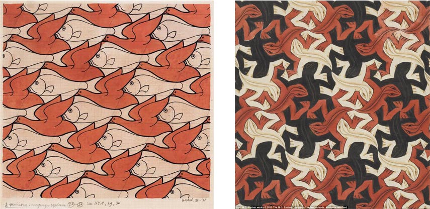
Fig 1.5.1 Example of Repitition in Design
https://www.widewalls.ch/magazine/repetition-in-art-artists-photography
Repetition refers to using the same element over and over again
in a design.

Fig 1.5.1 Example of movement in Design
https://inklingcreative.ink/movement/
Repetition can also be used to create movement, for instance when similar
elements are repeated regularly or irregularly it creates a sense of visual
rhythm.
Week 3 — Topic 4 & 5
Harmony and Unity
Unity refers to the repetition of particular elements throughout the
design. Harmony visualizes that satisfying effect of combining
similar elements. They have no contrast and can become monotonous. This is
achieved by having balance between areas of harmony and areas of contrast.

Fig 1.6.1 Harmony https://design.tutsplus.com/articles/the-principles-of-design--cms-33962
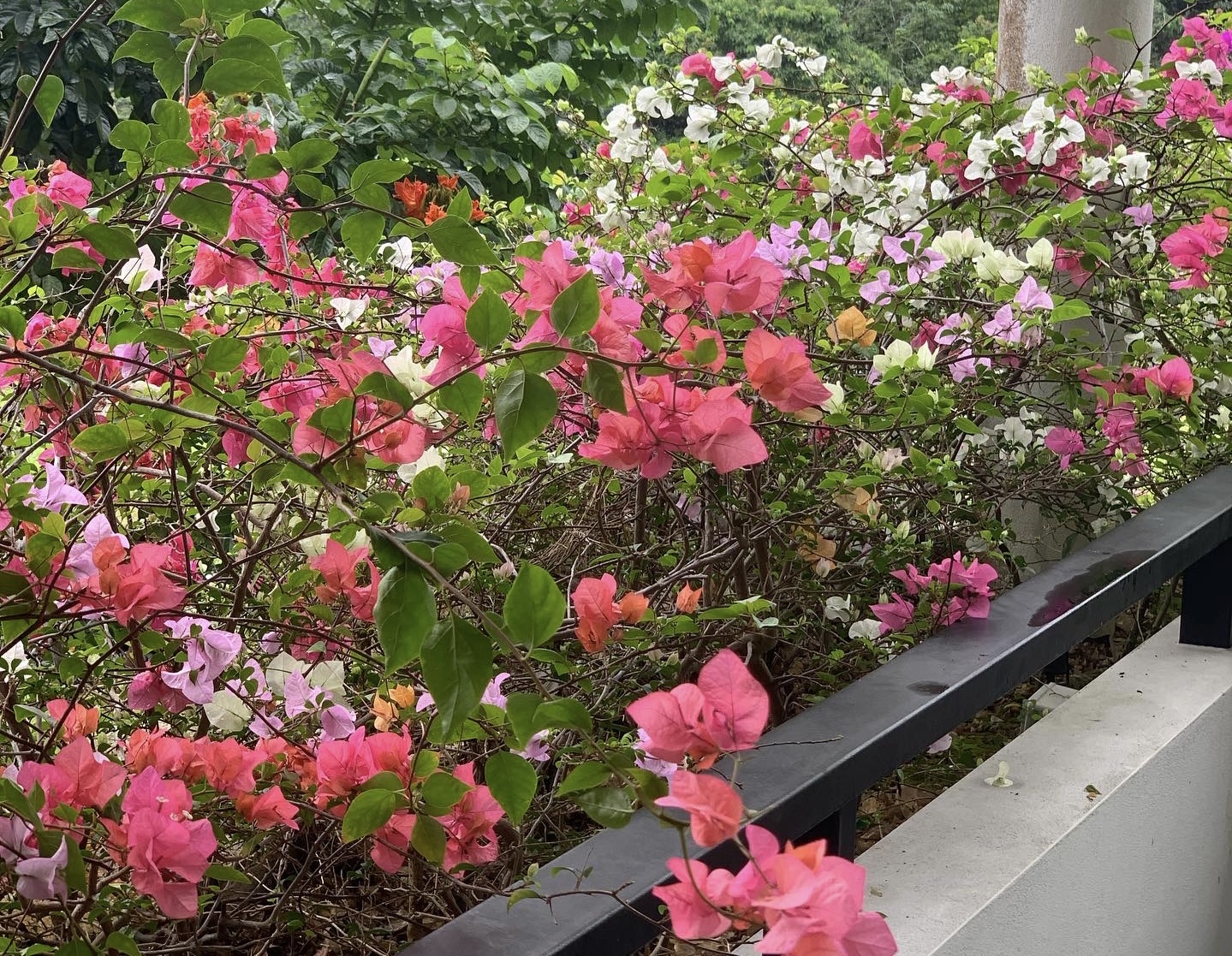
Fig 1.6.2 Example of Harmony Picture of Bougenville Flowers taken by Rachel Madeline
Scale and Proportion are both design elements that have to do with
size.
- Scale refers to the size of one object in relation to other objects in a design (size and dimension of figures and forms that is relative to a specific unit of measure)
- Proportion refers to the size of the part of an objects' relationship to other parts of the same object. (the relationship of 2 or more elements in a composition and how they compare to one another in size, color, quantity, degree, setting, etc.

Fig 1.6.3 Scale and Proportion https://www.widewalls.ch/magazine/scale-in-art
Symbol, Word and Image
Symbol : A sign, shape, or object that is used to represent something else. (Cambridge Dictionary, 2020)
In design, symbols can provide or convey information, equivalent to one more more sentences of the text, or even a whole story (Eco, 1976 & Pettersson, 2015)
FIg 1.6.4 Examples of Symbols logo-elements-design-vector-id1183804334
- Pictorial Symbols : Image related and simplified pictures which displays information about something
- Abstract Symbols : looks like the objects they represent but have less details
- Arbitrary Symbols : no resemblance to the objects and ideas they represent
Word and Image
Typography is the design and arrangement of text to convey a message or concept. It is crucial to choose the right words to pair with the imagery as it would deepen the meaning of the design. Suitable typeface and positioning of the type will result in visual hierarchy.

Fig 1.6.5 Example of Word and Image
❥INSTRUCTIONS


I wanted to go for the idea of someone who feels like they don't belong, an outcast because they stand out in a crowd which is suitable for the context of emphasis in design and I tried to keep the design as minimalistic as possible, so I kept the art style as a cartoon doodle.

 Fig 2.2 Hanahaki disease art reference


2.4 Feedback
C. HARMONY & UNITY


%EF%BD%9E%20on%20Twitter.png)


2.3 Final Design 
E. WORD AND IMAGE


2.3 Final Design
❥EXERCISES
Design Principles
- Gestalt Theory
- Contrast
- Emphasis
- Balance
- Repetition
- Movement
- Harmony and Unity
- Symbol
- Word and Image
A. EMPHASIS
1. Small Recap
Emphasis is a part of a design that catches the viewer's attention due
to the focal point being contrast compared to the other areas of the
design to make it stand out.
2. Design Process:
2.1 Visual Reference
Fig 1.1 Reference Example of Emphasis
https://www.blendspace.com/lessons/hDlCzxBStM6TIA/5-emphasis
Fig 1.2 Drawing Reference Example of Emphasis
https://id.pinterest.com/pin/767300855273212775/
2.2 Idea exploration

Fig 1.3 Design Process for Emphasis

Fig 1.4 Design in Multiple contrasting colours
To convey the concept of emphasis, I decided to contrast the colour of
the focal point with its surrounding areas. First I tried using pink
as the surrounding areas and white as the focal point, but the colours
were a bit bland for them to be contrasted. To make it more contrast I
decided to go with a warm and cold colour, but using a bright warm
colour for the surroundings makes the focal point lose focus,
therefore for the final design I chose to go with yellow as the focal
point and blue for the surrounding areas to make the focal point stand
out.
Adding a paperbag to cover the head also further expresses the context
of emphasis and also visualizes the idea of being an outcast who feels
like they don't belong in the crowd.

Fig 1.5 First Design Of Emphasis
2.3 Final design

Fig 1.6 Final Design of Emphasis
2.4 Feedback
To make it more contrast I was told to add more detailed contrasting
colours to the main focal point to make it stand out more so I decided
to add more warm colours but still kept the design simple.
2.5 Reflection
The concept of not being able to fit in goes hand in hand with the idea of emphasis where one object stands out from the rest. A dilemma occurred when I had to decide on the colours so I experimented with the colours that really contrasted each other and decided to go with warm against cold colours. Initially I planned on going for the focal point in blue and the rest in yellow colour but that made the focal point look dull and does not make the viewer's eye lose focus from the main element since yellow is a brighter colour, even though the colour blue accurately expresses the main figure's emotions; feeling like they dont fit in.
B. BALANCE
1. Small Recap
Asymmetrical Balance — Unequal visual weight on each side of
the composition where one side of the composition might contain a
dominant element which could be balanced by a couple or lesser
elements on the other side.
2. Design Process
2.1 Visual References

Fig 2.1 Hanahaki disease art reference
https://id.pinterest.com/s_u_p_hailang/hanahaki-disease/

https://www.redbubble.com/i/art-board-print/Floral-Rib-Cage-by-jilliangyo/28775855.NVL2T
2.2 Idea exploration

Fig 2.3 Heart Sculpture and Sketch of Rib Cage

Fig 2.4 Rough sketch of Ideas
I decided to use the idea of Hanahaki disease (a disease caused due to an individual experiencing unrequited love) to express the concept
of Asymmetrical Balance because the structure of the ribcage is
symmetrical, thus adding the flowers on one side of the rib cage
further emphasizes the idea of it being asymmetrical.

Fig 2.5 Final Design of Asymmetrical Balance, angles from the top and
bottom

Fig 2.6 Final Design of Asymmetrical Balance, angles from the left, front,
and right
- The heart sculpture is made out of air dry clay and is placed a bit to the left side of the rib cage to make it as accurate as reality.
- The ribcage is made out of cardboard due to paper mache not being able to support the weight of it. It is then painted then placed in the middle of the canvas.
- The background consists of two colours and has a perfect balance. It is a gradient of blue to green which contrasts the colour of the ribcage and the flowers to emphasize balance. Newspaper is used to convey the thoughts and feelings of the individual experiencing Hanahaki disease.
- Colour of flowers are contrast to the ribcage's monotone colours; flowers are made out of origami paper and crepe paper.
- Flowers are supported by using green aluminium floral wires connected to the heart to express the concept of the Hanahaki disease.
2.3 Final design
Fig 2.7 Video of final design of Balance
This piece is inspired by the Hanahaki disease, a fictional disease where flowers start to grow in one's lungs due to them experiencing unrequited love which means one-sided love. The flowers growing from the hearts blood vessels, spiking out of the ribs signifies the words a person couldn't express to someone they have feelings for, because that person loves someone else. the more pent up feelings kept as a secret, the more flowers grow in the lungs, thus the lesser the person has space to breathe.
There wasn't any specific remarks regarding the design, only needed to upload further documentation to exhibit the work.
2.5 Reflection
This design made me understand the proportion of asymmetrical balance
where one side is more dominant than the other, which in this case the
one that indicates it is the flowers. I tried using paper mache for the
ribcage but unfortunately it could not support the sculpture so I had to
use 2mm cardboard. It took quite a while to cut the cardboard as the
material was thick and I did not have the right tools to cut it but
overall I really enjoyed the design process as it is something new and different from the artworks that I usually work on.
1. Small Recap
Harmony is accomplished by the repetition of a particular design element,
such as colour. shape texture, etc. It gives a sense that all the elements
fit together and they fit the same theme, aesthetic, style and mood.
Unity refers to the repetition of particular elements throughout the
design.
2. Design Process
2.1 Visual References

Fig 3.1 Sam Cox Doodle https://mymodernmet.com/mr-doodle-art/

Fig 3.2 Sam Cox Doodle https://www.bukowskis.com/en/auctions/623/1208-mr-doodle-sam-cox-palm-pals
2.2 Idea exploration
Considering the design principle to be harmony and unity, I thought of
doing a doodle that allows the elements to complement each other and the
shapes of the doodle echo each other. I decided to do some research and
found Sam Cox's doodle that caught my eye because of it's unique and
satisfying doodles using thick black markers. I was inspired by Sam Cox's
doodle style so I decided to give it a shot with my own personalised characters
but in Sam Cox's doodle style.
I drew on my iPad in an app called Ibis Paint X using the Dip Pen Hard
brush and adjusted the size to be thicker so it would fit Sam Cox's thick
black marker styled doodles. Following Sam's way of doodling by going
straight for it without sketching out ideas, I decided not to sketch out
my ideas first and directly drew with the thick brush
Style, Inspiration : Essentially his style is thick black line work on white backgrounds.
His style and artworks have all been influenced by various artists such as
Pablo Picasso, Keith Haring, Andy Warhol, Banksy and other graffiti
artists plus Walt Disney and his love of video games and comics. Give
him a black marker and a white surface and he ought to fill it with his
unique doodling with a variety of comprising symbols, odd characters and
complex patterns. He doesn't only draw on paper but also draws on walls,
furnitures, clothes, caravans, and he wishes to one day draw in a whole
house.
Fig 3.3 First Attempt/Idea of doodle

Fig 3.4 Second Attempt Idea of doodle
Fig 3.5 Third attempt of Harmony and Unity design
I decided to go with the third one as its the design that most expresses myself and has the most shapes and colours that echo and complement each other which is hand in hand with the context of harmony and unity.
2.3 Final Design

Fig 3.4 Final Design of Harmony & Unity
The characters I used here are filled with cartoons characters from tv shows and that kept me motivated to keep drawing and entertained me throughout the pandemic. I also referenced things that kept me entertained during this pandemic, which contrasts to the word illustrated above, "Bored". I really enjoyed drawing this and Im fond of this drawing because its filled with elements in my life that made me happy.
2.4 Feedback
To emphasize harmony further and to create balance, more elements must be coloured in black.
2.5 Reflection
This design was overall really fun to make, as doodling is really abstract without any planning or much thinking required. The colours and the shapes complement and echo each other to create a sense of balance. The overall process also didn't take that much time as I just had to doodle without sketching my ideas beforehand, just like how Sam Cox did his doodles.
D. MOVEMENT
1. Small Recap
- The way a design leads the eye in, around and through a composition
- Motion or movement in an image occurs when an object seems to be moving
2. Design Process
2.1 Visual References

Fig 4.1 Art Reference https://pin.it/3yrhyfV
%EF%BD%9E%20on%20Twitter.png)
Fig 4.2 Art Reference https://pin.it/1pwGKX3

Fig 4.3 Art Reference https://pin.it/1mLrhcv
2.2 Idea Exploration
I was planning to do a girl skipping in puddles through the rain going
in an opposite direction of the rain. Lacking in movement, I decided to
change my idea to a girl running through a field of flowers with the
flowers being carried by the wind opposing the direction of the running
girl to visualize movement.

Fig 4.4 First Rough Sketch Idea

Fig 4.5 Second Rough Sketch Idea

Fig 4.6 First digitized attempt on movement design as sketch/progress

Fig 4.7 First digitized attempt on movement design as progress
Fig 4.8 Final Design of Movement
This design features a girl running through a meadow against the wind which visualizes movement. I'm really fond of the usage of flowers to be used to express a message through a piece of art. The artstyle I was going for is meant to be simple, cartoony and minimalistic by minimalizing too many details and shading to keep that easygoing chill approach to the art.
2.4 Feedback
The flowers flowing through the wind looks stiff due to them being too grouped up thereofore the flowers and leaves need to have more distance between each other or more scattered to make it look flowy. The flowers were also too structured which makes it look stiff and therefore needs to be spread apart
2.5 Reflection
At first I wasn't really confident with the work because I wasn't sure if I could execute my idea as expected. The process of digitization was a struggle as I wasn't really satisfied with how it looked since the flow looked stiff which doesn't go hand in hand with the chosen principle, 'movement'. I tried to improve the flow by spreading the flowers out and made the flowers go to the direction of the wind blowing the flowers.
At first I wasn't really confident with the work because I wasn't sure if I could execute my idea as expected. The process of digitization was a struggle as I wasn't really satisfied with how it looked since the flow looked stiff which doesn't go hand in hand with the chosen principle, 'movement'. I tried to improve the flow by spreading the flowers out and made the flowers go to the direction of the wind blowing the flowers.
1. Small Recap
A design consisting of words composed in an image of that context. Words chosen to deepen the context of the image to represent a message or a piece of information.
2. Design Process
2.1 Visual References
Fig 5.1 Reference Design for Word and Image
Fig 5.2 Reference Design for Word and Image

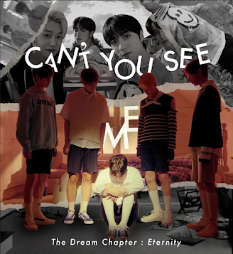
Fig 5.3 TXT "Cant you see me" Image used for Words and Image Design
https://www.kpopstarz.com/articles/293046/20200518/txt-performed-cant-you-see-me-on-stage-for-the-first-time.htm
2.2. Idea Exploration

Fig 5.4 First Attempt of editing the design on photoshop

Fig 5.5 Process of editing on photoshop
To further emphasize the message put forth in TXT's song called "Can't You See Me?", I decided to reposition some of the text behind the figures as if they were hidden, or placed in a blindspot where only parts of the text are shown to the viewers while parts of it are at a blind spot. I decided to separate the figures and put them in a layer above the text so the text would be placed behind the figures, as if they were hidden.
After the feedback, I decided to rework and reposition the elements used in the design. I also changed the font to Futura to avoid a serif typeface.
Fig 5.6 Process of second attempt after feedback

Fig 5.7 Process of second attempt after feedback
I decided to express the change between the past and present situation of the group's friendship and bond through a collage using contrasting colours with the past being represented in black and white and the present being portrayed with colours. I added another torn page at the bottom with a monochrome floor to balance the composition.

Fig 5.8 Final Design of Word and Image
This design is inspired by a song from a Kpop group called TXT which is called "Can't You See Me?" in their comeback album called "The Dream Chapter : Eternity". The song is about the loneliness caused by the separation between friends after the bond between friends is no longer there anymore. The emotions felt by the boy is portrayed in the music video as well as the image above which explains my choice of the image above, because it expresses the boy's emotions in the music video through one image. The image I used is taken from the album photoshoot. Dark colours were also used in the music video thus the colour scheme being used in the image above being warm to represent the connection and relationship which is contrast to the emotion being portrayed through the pose of the boy looking sad. With the use of collage, the portrayal of the group's friendship and bond in the past is shown in monochrome colours to contrast the present situation visualized in colours.
2.4 Feedback
Further edits of the image is needed. Serif is not allowed to be used as the font title and it needs to have a more solid font. More space between the T and Y is needed because the words "Cant" and "You" are too close to each other. Positioning of some letters should be put front and behind the figures to create more variation and dynamism.
2.5 Reflection
It was quite the challenge to edit the image into a collage whilst maintaining the main elements from blending in with the background due to the background being too crowded, so I tried to think of how to express the concept of the song through a collage. It took quite awhile to come up with the idea and the layout of the design but in the end I was pretty satisfied with how it turned out.


Comments
Post a Comment