UX Design — Task 4
10.11.2023 — 01.01.2023
Rachel Madeline / 0356994
Bachelor of Design
(Hons) in Creative Media
Final Project — Design Prototype
❥INSTRUCTIONS
❥TASK
Development Process of High Fidelity
Throughout this task, this is the development stage of the app
itself. First of all, we decided to start on the brand identity
itself, meaning we considered the colour palette, the mascot design
and the logo as well as the fonts that we are going to
use.
For the colour palette, it took us quite awhile to decide on one as
we had a lot of ideas of what would the overall brand look like and we
kept going forth between choosing pastel cold colours or a mix of cold
and warm colours but make it more vivid and vibrant. We ended up
deciding on the vibrant one as it had the most contrast and had
colours like blue and green which reflects on colours that are often
used in a hospital or a pharmacy and having the orange that balances
it out as a complementary colour that contrasts both the green and
blue shades.
Fig 1.1 Exploration of color palette
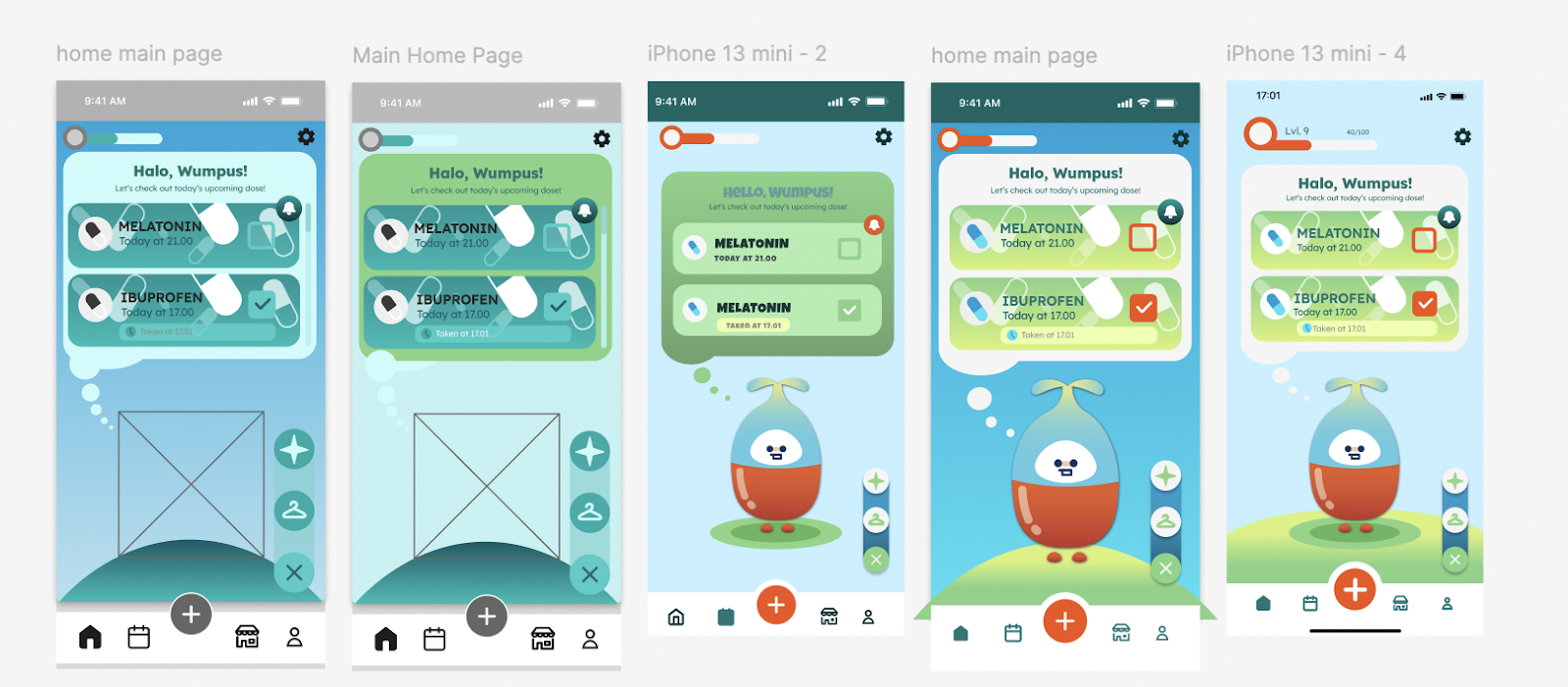
We also worked on the low fidelity prototype at the same time where
we added the reward system and the reminder system, where users
could claim rewards after achieving a milestone or a certain amount
of pills taken on time.
Fig 1.3 Low fidelity prototype
Adifa worked on the elements of the pages like the pills and the
star to represent certain features of the app and me and Derin
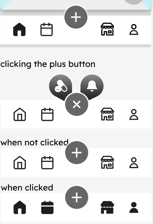
worked on the navigation bar and how it would work, Derin worked on
the icons.
Fig 1.4 Nav bar design in low fidelity
Three of us tried sketching some dieas of the mascot design on
procreate and we decided to go for a design that encapsulates a
pill since its a pill reminder app and we took inspiration from
BMO's (from adventure time) design as well. We decided to go with
my design so I proceeded onto digitizing the mascot and coming up
with the colours. I also drew some of the costumes that could be
available on the app for users to claim.
Fig 1.6 Draft digitization and experimentation on colours
Fig 1.7 More mascot design variations
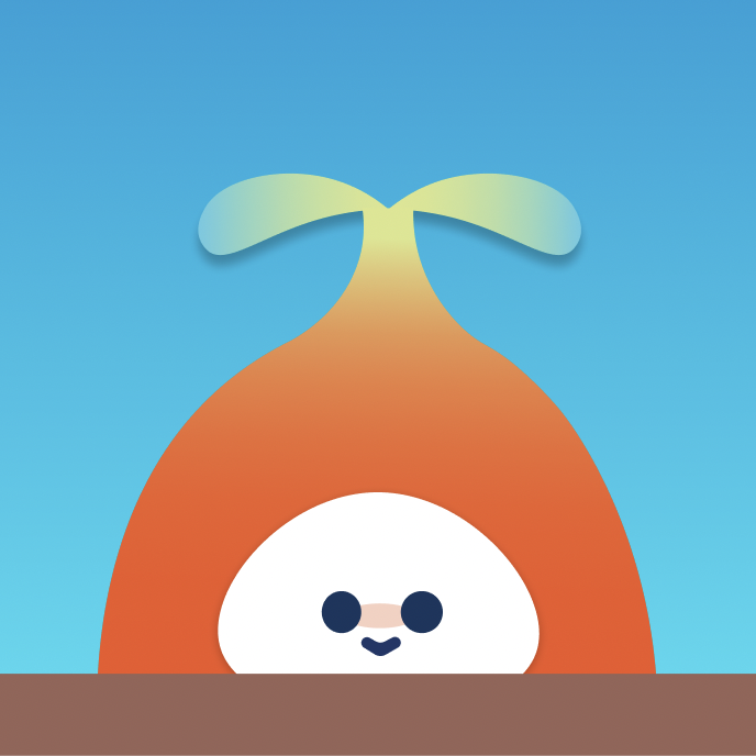
We decided to go with the red and blue one with the sprout at the top and incorporate a feature where when the user keeps missing their doses, the sprout would wilt and the pill would look sick to make it more interactive.
For the logo, I had an idea to make the pill pop up when you first open
the app as if its a sprout growing out of the ground as an introduction
to the mascot.
Fig 1.8 Logo of app
Fig 1.9 Animating the logo in the app
Me and Adifa worked on the Mascot interactions, rewards including
costumes and customization while Derin was customizing the
reminder and login pages and linking each of the pages together. I
added some animations to some of the pages to ensure a smooth
transition to some of the features.
After Derin was done with her pages I made some adjustments to
the corner roundings and margins and colours, fonts to make it
more consistent with the rest of the pages and to keep it all
uniform.
Fig 1.10 Final Prototype
Usability Testing
Once this was all done it was time for usability testing, I worked on the
survey and we distributed it to 8 respondents and analyzed it to obtain the
user feedback, suggestions and limitations of the app and compiled it into
task 4 documentation document below.
Fig 2.1 Survey for Usability Testing
Fig 2.2 Task 4 Final Documentation
❥FEEDBACK
WEEK 14
- pay attention to the borders and corners on the profile
- highlight with yellow colour after making changes
❥REFLECTION
I really enjoyed this whole design process as I was doing
it with my bestfriends but I could also integrate the mascot
and the gamification which was what I was looking forward to the most and
I'm really satisfied with the outcome. Huge thanks to Derin
and Adifa, I couldn't have done it without them and I
enjoyed the whole process from start to finish. Even though
we were all foreign with figma's interface and features we tried our best to get familiar
with the interface by watching tutorials and experimenting
even to reach the expectations of our outcome. It took quite a lot of trial and error but we pulled through, and this was probably the most cooperative and peaceful group project I had this semester, again props to both Derin and Adifa.


Comments
Post a Comment